Insulin Addict
Design of an app to help manage Diabetes
Project: CareerFoundry
Role: UX/UI Designer
Timeframe: October 2020 - January 2023
Tools
Problem Space
“Diabetes mellitus refers to a group of diseases that affect how your body uses blood sugar (glucose). Glucose is vital to your health because it's an important source of energy for the cells that make up your muscles and tissues. It's also your brain's main source of fuel.” - Mayo Clinic (2020, October 30)
Managing diabetes might be challenging as it requires a lot of dedication to regularly monitor your health metrics and observe how your body reacts. Having digital tools that will make that process easier, is an important improvement in leading a healthier lifestyle and staying on top of the condition.
Our Solution
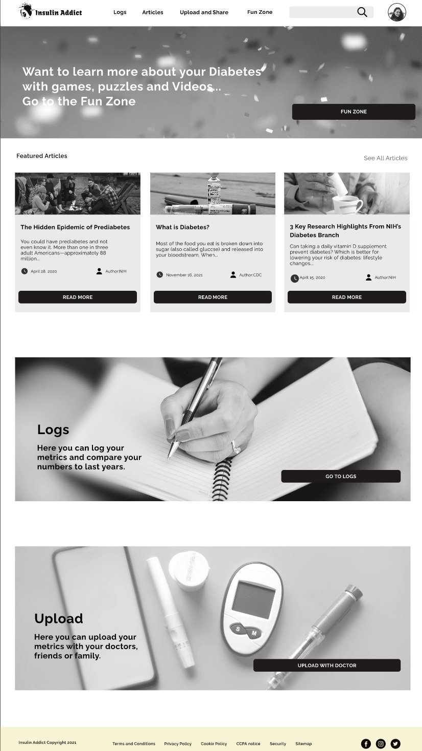
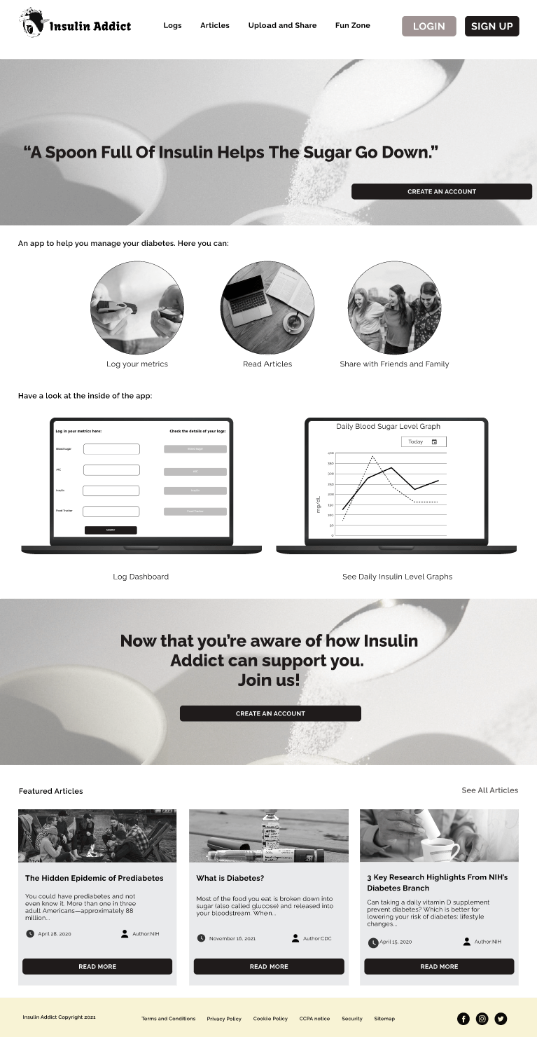
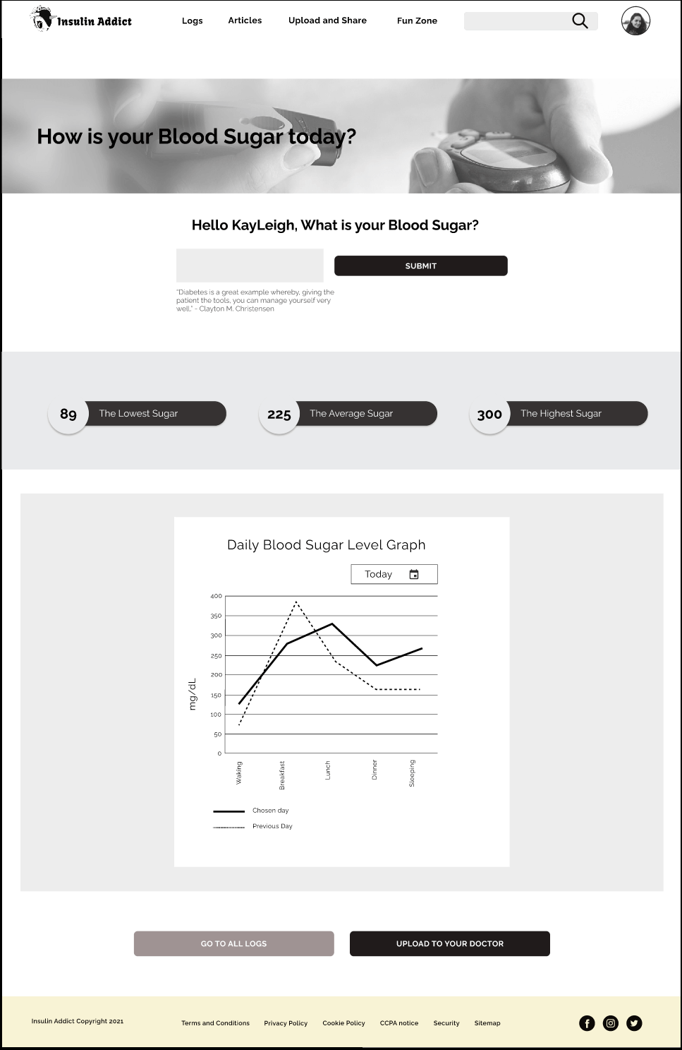
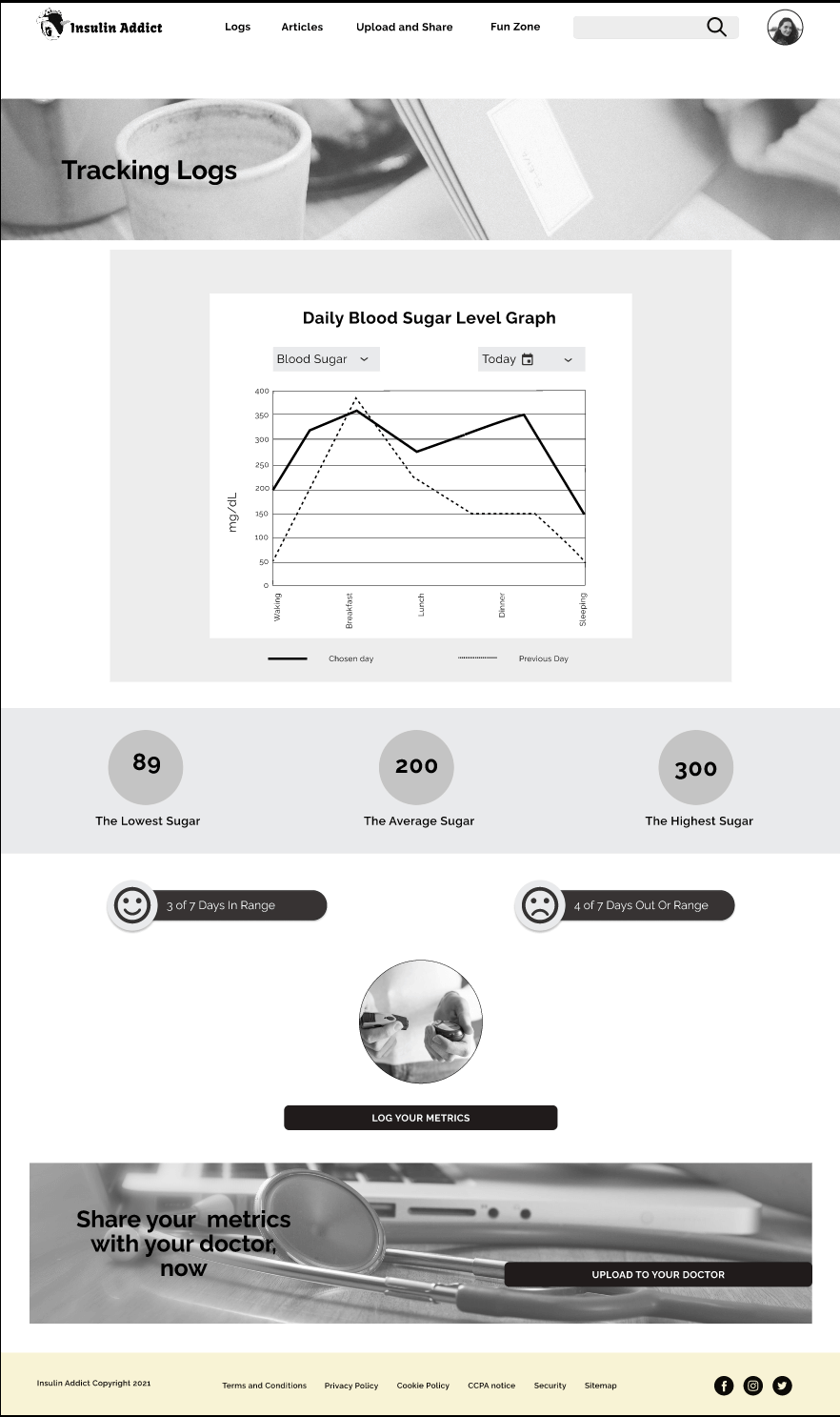
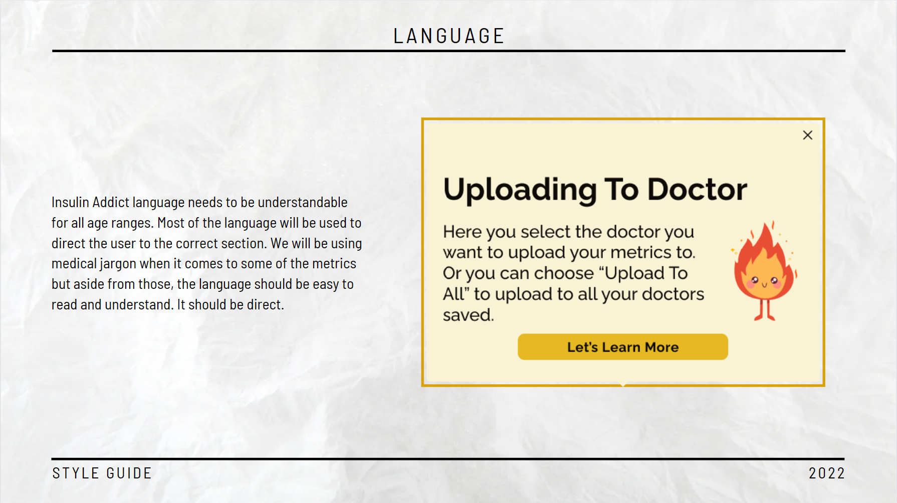
The Insulin Addict app allows Diabetics to log in to a responsive health and well-being portal to record their medical information such as Blood Sugars, A1C, and insulin amounts. They then will have the ability to upload and share this information with their doctors, friends, or family. It also provides them with access to a general physical and mental well-being knowledge base.
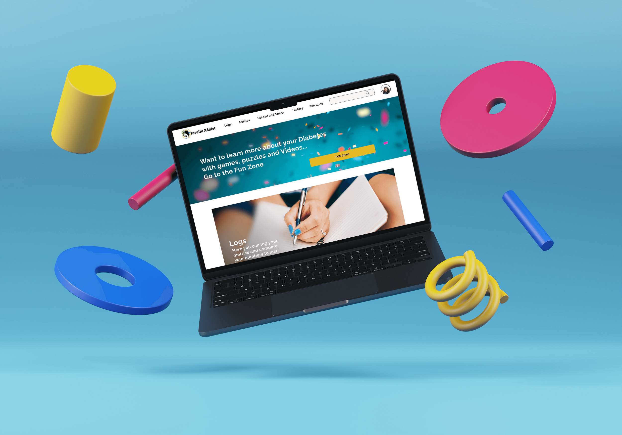
As an outcome of the project, we created a responsive web app that allows users to manage their diabetes with the following features:
Logs - This feature allows the user to log in their daily or hourly health metrics such as blood sugars, A1C, insulin, and more.
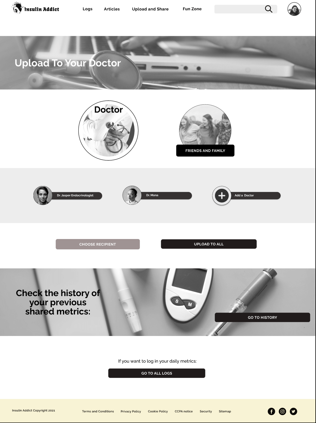
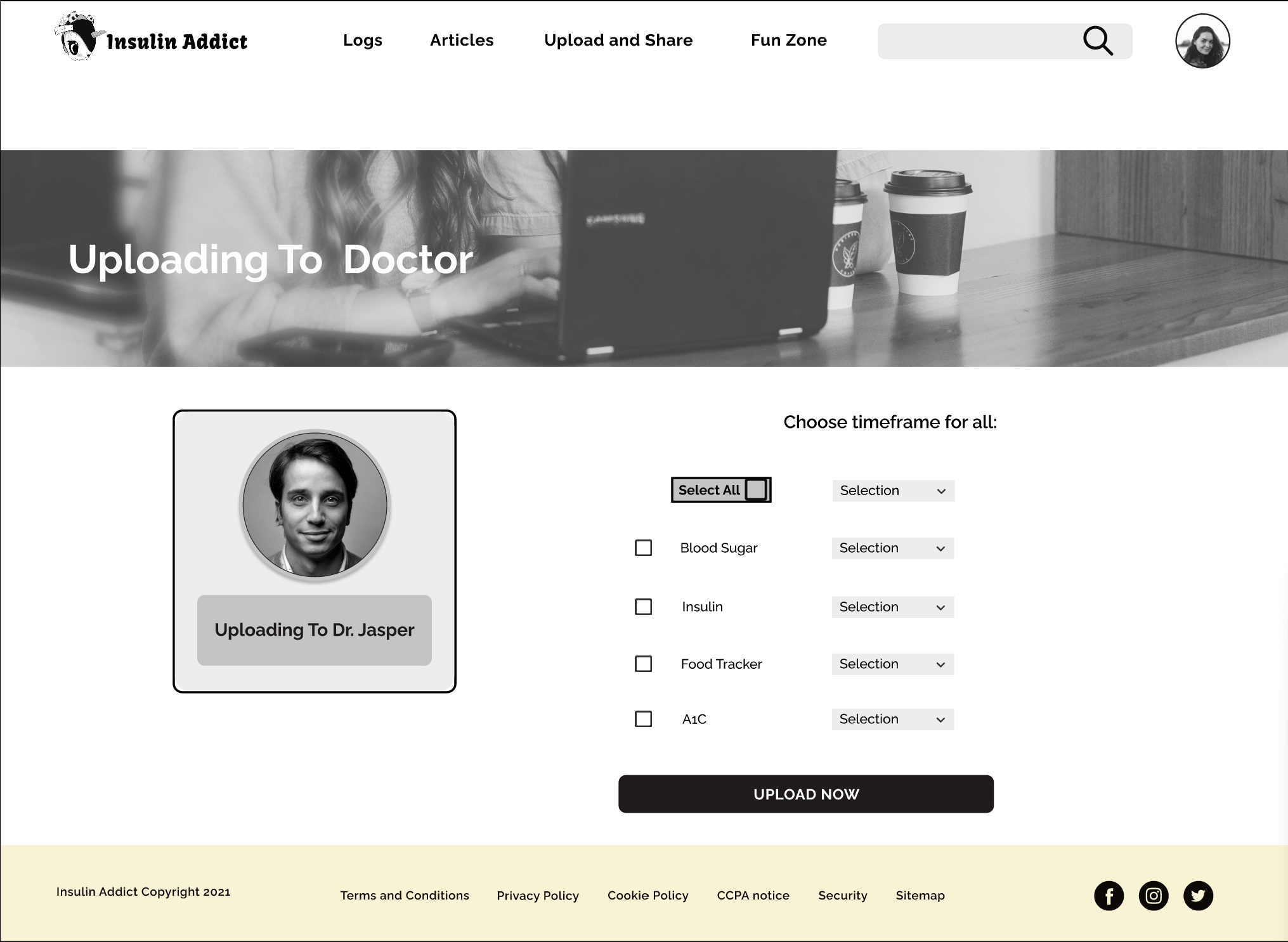
Upload and Share - This feature allows the user to upload and share their health metrics with their doctor or family and friends
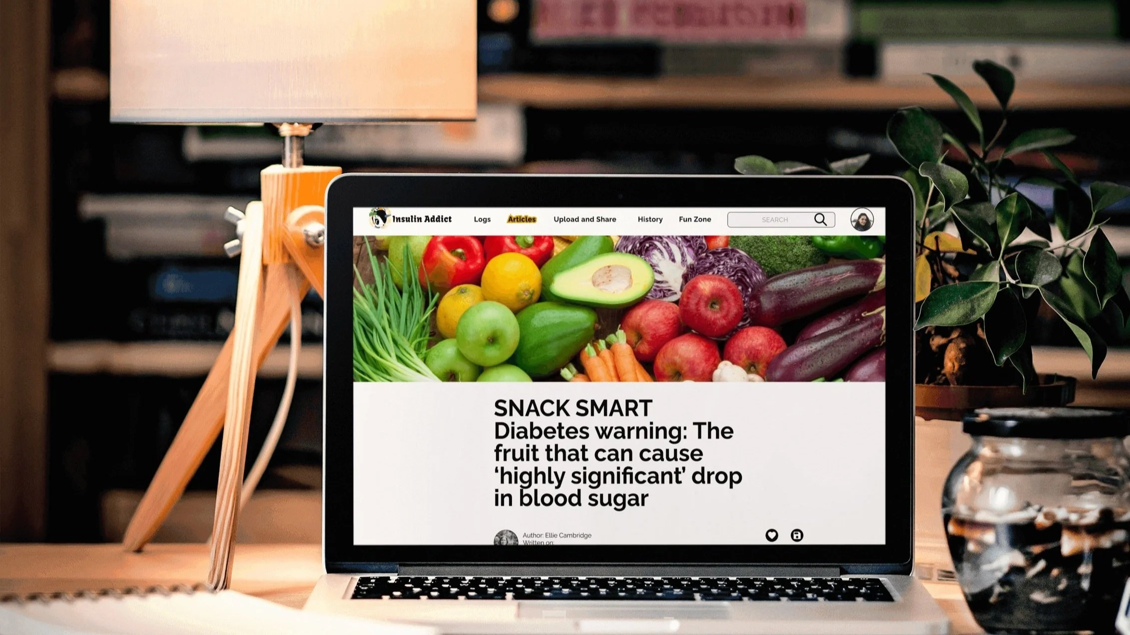
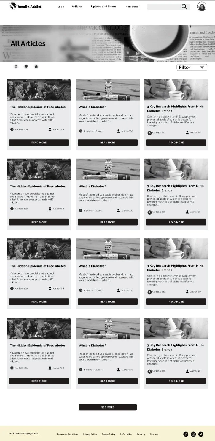
Articles - This feature contains a knowledge base about diabetes and essential topics related to it that can support the user.
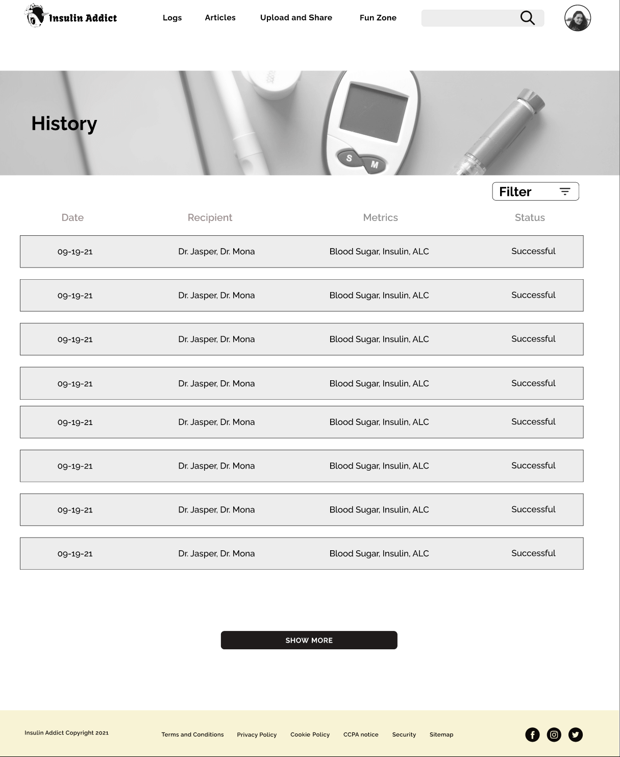
History - This feature keeps track of all the historical health metrics connected with the account and allows for search and review of the data collected.
The Process
I followed the User Centered Design process with included the following phases:
Discovery
In the first phase of the project, we started with defining the problem statement and taking a deeper dive into the market segment by doing a competitive analysis. That allowed us to land on the features for the app and create user stories for each one of them.
Problem Statement
Diabetics need a way to manage their diabetes by logging their medical files and blood sugars to share with their doctors because they’re trying to take better care of themselves. We will know this to be true when we see them inputting information regularly and sharing their information with their doctors through the app.
The users need a way to look up articles, videos, and activities to help them better understand diabetes and that will help them with their overall diabetes management because they are trying to grow their knowledge base on their disease. We will know this to be true when we see them checking into the app daily to read and learn from the resources available.
Competitive Analysis
To better understand the market segment where Insulin Addict will operate, we conducted a competitive analysis, including a SWOT analysis and an in-depth UX audit focusing on the advantages of each platform and pointing out areas for improvement. We chose three main competitors on the market and below I’m going to showcase one of them as an example of my process.
Competitor Analysis CareZone
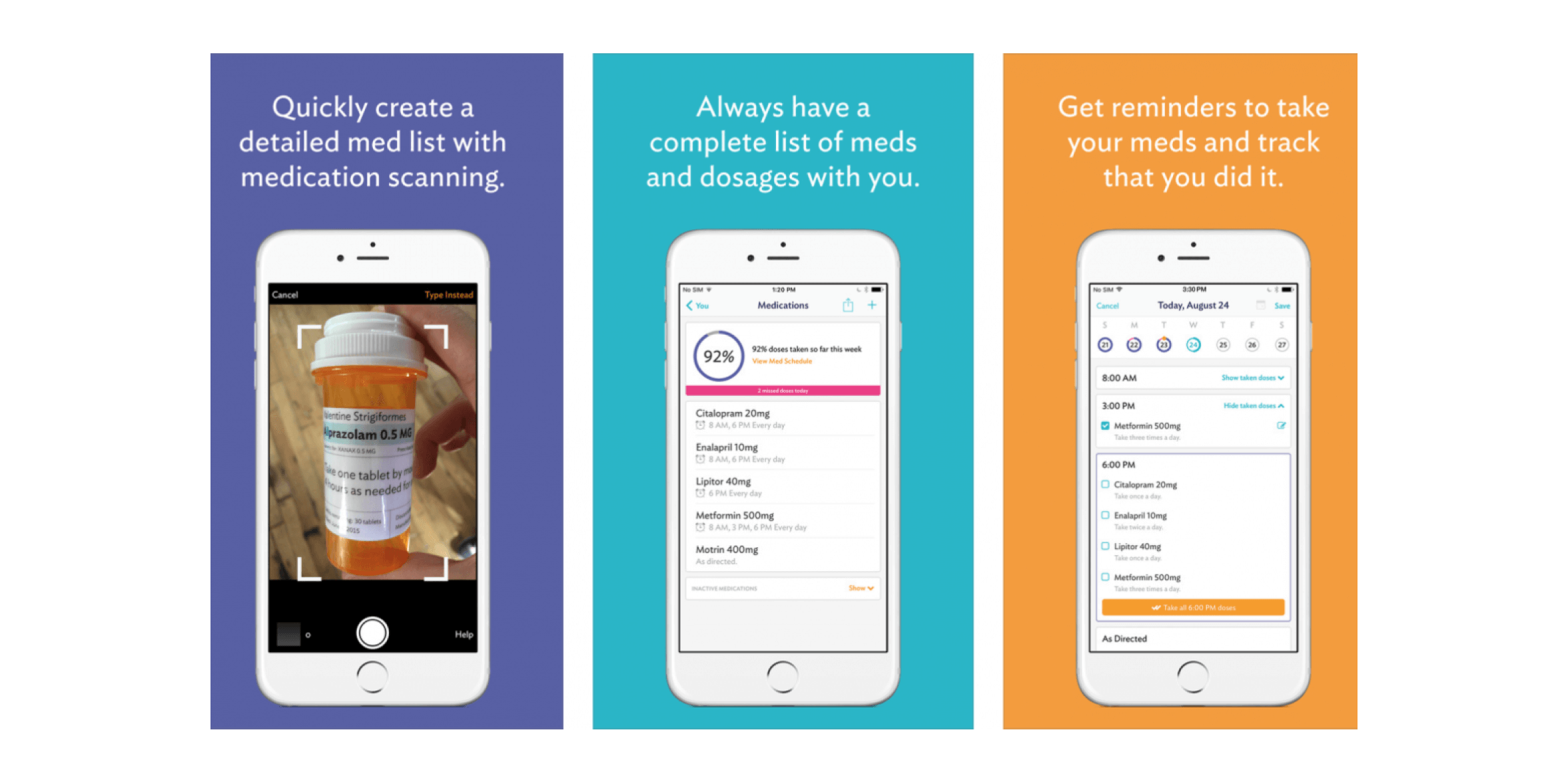
We looked at one of the competitors - Care Zone (Journal | CareZone), which helps users input their data for easy sharing and tracking. Care Zone is a downloadable app through Google Play or Apple Store. It also can be accessed through a website and all the features are available on the website, unlike Sanvello.
We chose this app for its simple inputting of data. It has many features that make keeping track of your medical information stress-free. One of the main features that popped out was being able to take photos of the medications with your camera. It has you take different angles to ensure they have the full medication item photographed. This app has a few friction points in the call-to-action prompts and the upload time when photographing medications. This app is a great example of input data that we would like to see in a Diabetes specific app.
Overview
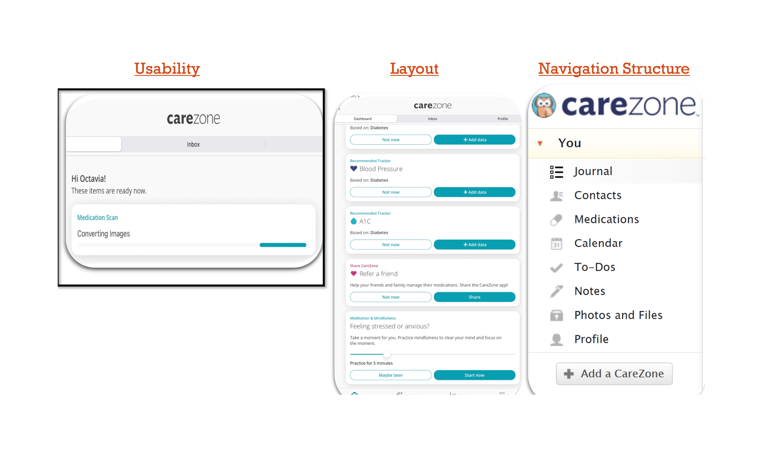
UX Competitive Analysis
Usability
CareZone’s application is simple to use and user-friendly. The one main friction point was the medication scan does not work for processing images. It has been roughly 21 hours and it still is converting the images. Overall, the app concept was well made for both tech-savvy and non-tech-savvy users.
Layout
When you first log in to the app on your mobile device you see any updates or processes that it’s currently working on. Underneath you see the “Recommended for you” section which shows all the health trackers available. After that, you see the opportunity to share with a friend. The last section on the bottom is for “Meditation & Mindfulness”. The layout is very simplistic and not overwhelming for users but the overall layout is lacking character and Information hierarchy.
Navigation Structure
CareZone uses two different types of navigation menus on the mobile app. It has Hamburger menus at the bottom of the page and the standard horizontal menu at the top and bottom. The Website uses vertical sidebar navigation. The navigation keeps the app neat and organized while making it easy to find the sections the user needs. The organization of the features was well thought out.
Differentiation
The CareZone app is a simplistic and easy-to-use application with a great system for entering Medical data to easily share with friends and family. The access to the app is compatible with many different systems allowing a wider user base. A large number of trackers and medication scanning make this app able to cover many different medical conditions. Adding an option to share these records securely and privately with all healthcare physicians the users want is something lacking on this application that will be prominent in our app. Also allowing the app to have a more aesthetic layout and themes will be another draw for our users to pick our app over CareZone.
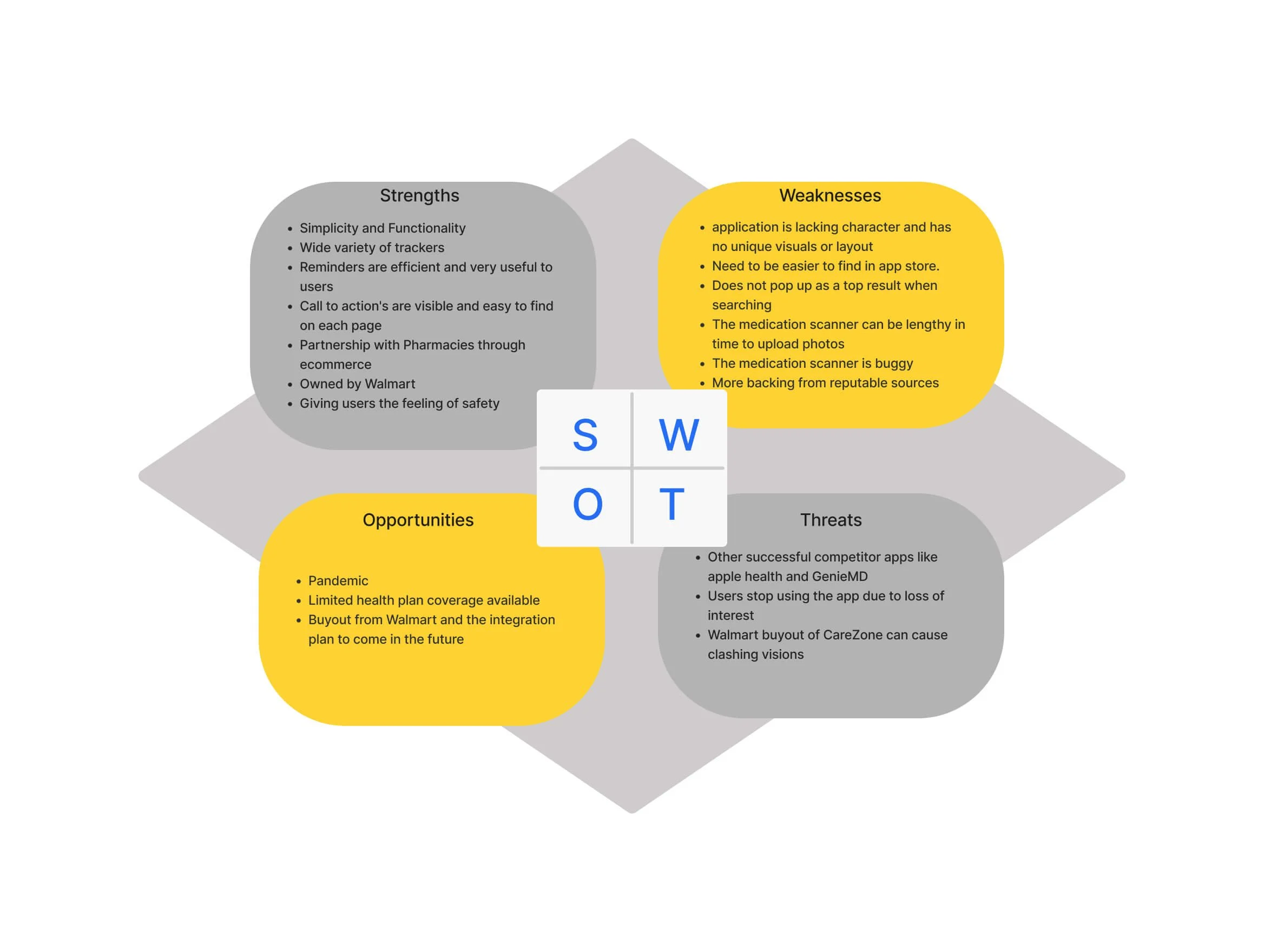
SWOT Profile For CareZone
User Surveys and Interviews
Having conducted a competitive analysis, we then moved to user research to be able to better understand the target audience's expectations, behavior patterns, and needs.
Research Goals
Learn more about the target audience in their journey with Diabetes
Learn about behavior patterns to manage Diabetes
Learn which applications, websites, or platforms are used to support their Diabetes
Learn various commonly used features and potential pain points
The Process
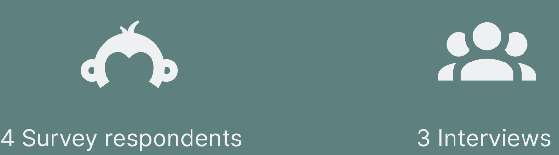
The Survey and Interview process was challenging in finding participants that are diabetics. I used Slack, Facebook, and many other resources to find users. In the end...
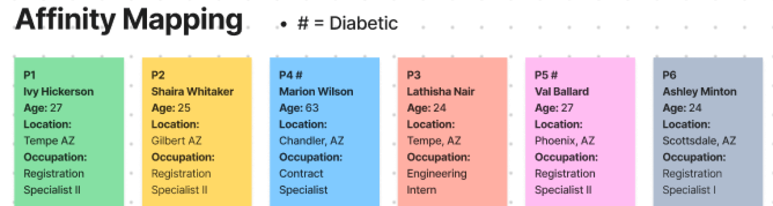
Having conducted interviews and surveys, we applied the Affinity Mapping methodology to capture and analyze all data gathered from the users. That allowed me to identify the most common topics and patterns among the participants.
Step 1 - All research data captured by participants.
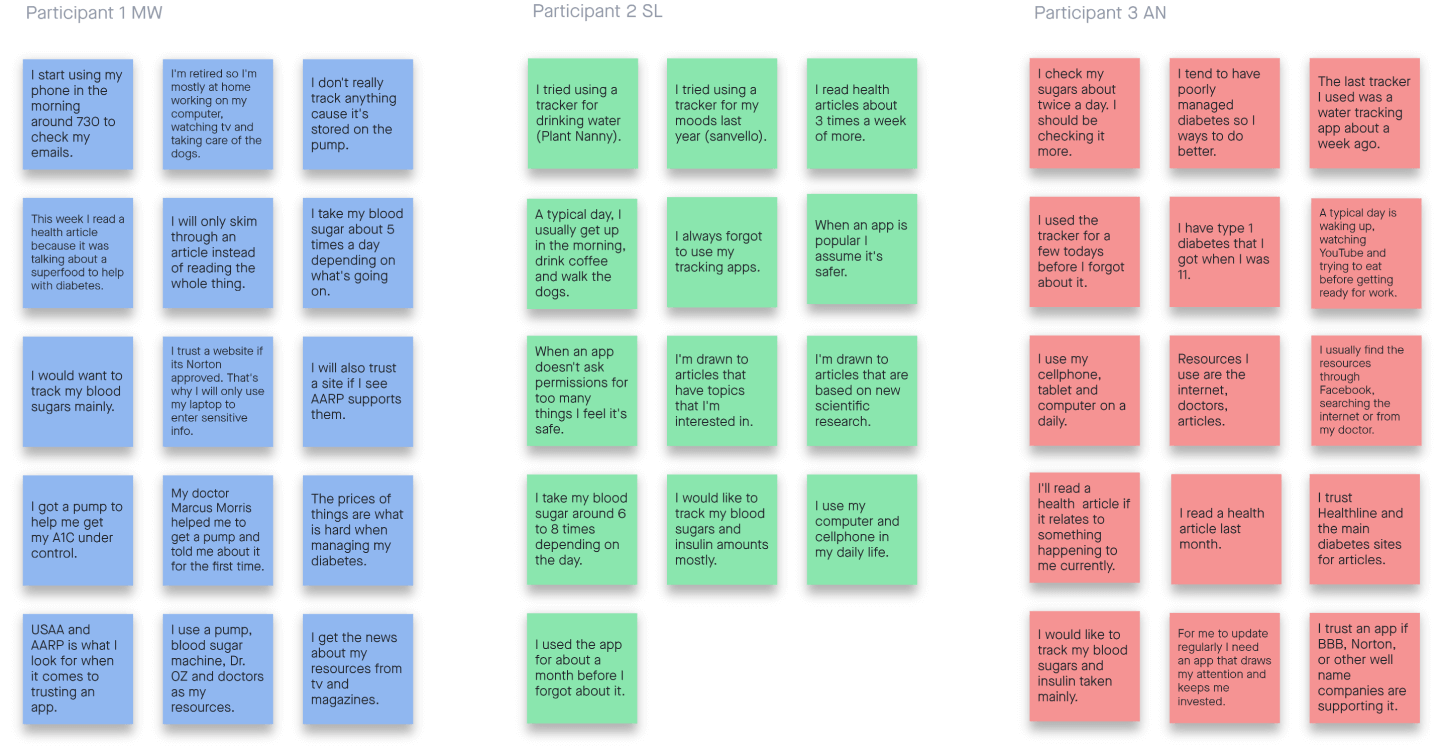
Step 2 - Data grouped by main categories.
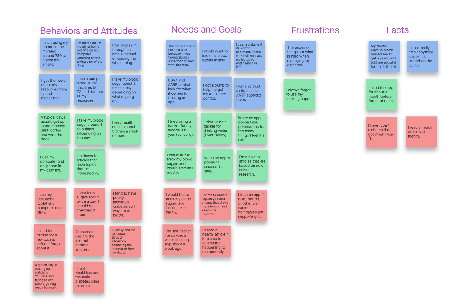
Step 3 - Affinity Maps created based on similarities observed in data.
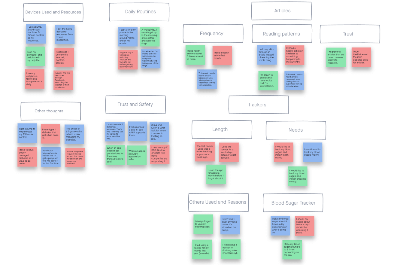
Insights
Devices Used and Resources
The usual common devices are used daily; cellphones and computers.
Daily Routines
Daily routines vary and the app needs to be easily accessible for all people no matter what.
ArticlesHealth articles seem to be sought out when the user is in need of certain information
Frequency seems to greatly differ between all participants.
TrackersTrackers need to be able to keep the user invested. Users will stop using apps very quickly if not interested.
Blood sugar tracking and insulin tracking are the most frequently mentioned.
Many reminders need to be set up for daily sugars.
Trust and SafetyTrust comes down to the companies that users use.
Can greatly differ between users but getting more well-known companies to back the app is key.
Other ThoughtsThis contains the facts and needs of the different users.
Having resources and backing of the medical company so that correct knowledge is available.
Shown below is a SWOT analysis outlining the strengths and weaknesses of the app, as well as opportunities and threads that the market segment where it’s operating pose.
We also conducted Usability Audit to closely analyze the different aspects of the app such as Navigation structure, Layout, Usability of its features, and Differentiation from other apps. This allowed us to identify areas for improvement and point out gaps where our app might be helpful.
Define
The next phase of the project focused on defining personas that would best represent the target audience of Insulin Addict, mapping out user journeys and user flows for the main features of the app.
User Personas and User Journeys
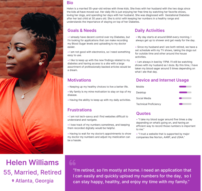
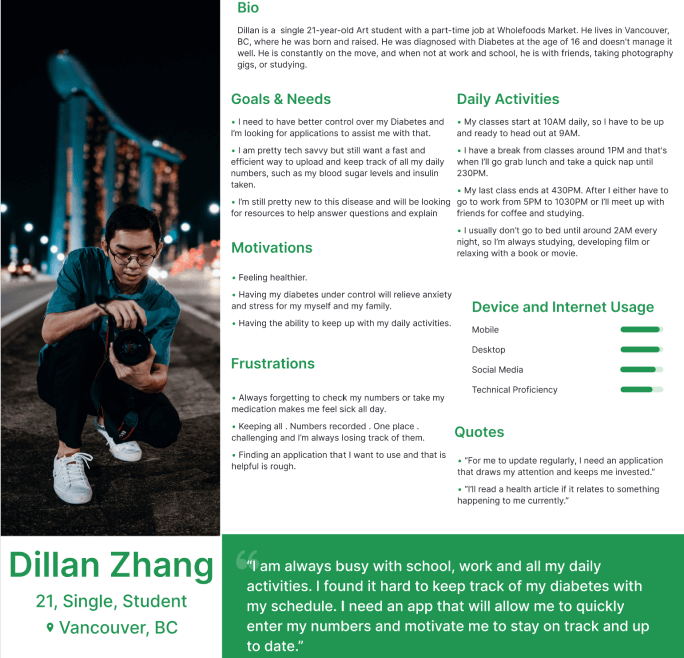
After interviews and the Affinity Mapping were completed, two personas were formed to help build the connection with our users. They are Helen Williams, 55, and Dillan Zhang, 21. They best represent two different types of users that will be interacting with Insulin Addict and their behaviors.
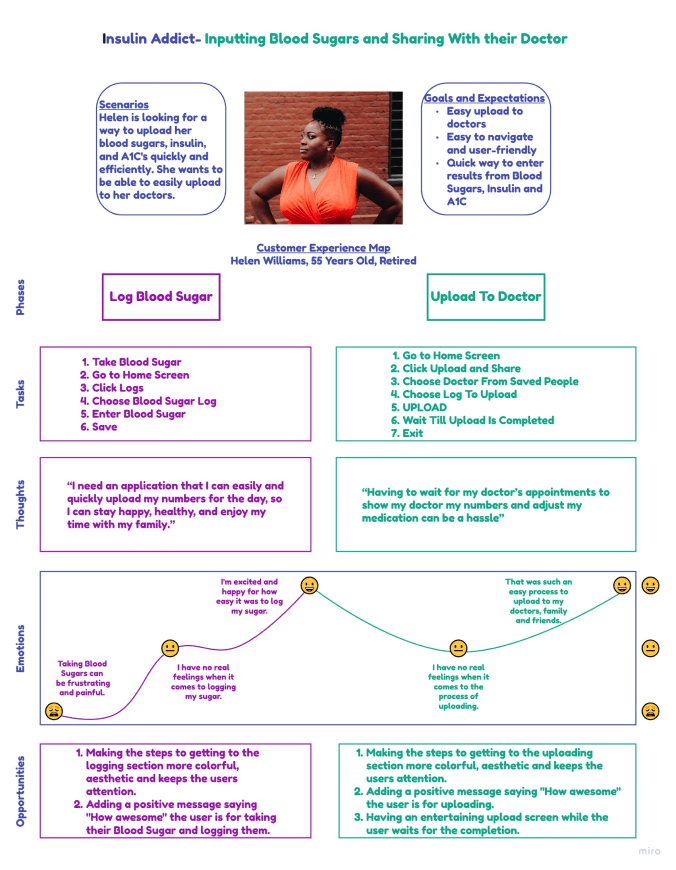
Based on the Personas profiles, we were able to map out their user journeys. Helen’s user journey started with her need to have an app that is not too tech-savvy to input her metrics and upload/share them with her doctors fast and easily. Dillan’s user journey started with his need to have an app that he can quickly input his numbers and motivated him to keep better track of his Diabetes with his busy schedule. Below is the breakdown of both of their journeys.
Helen User Journey
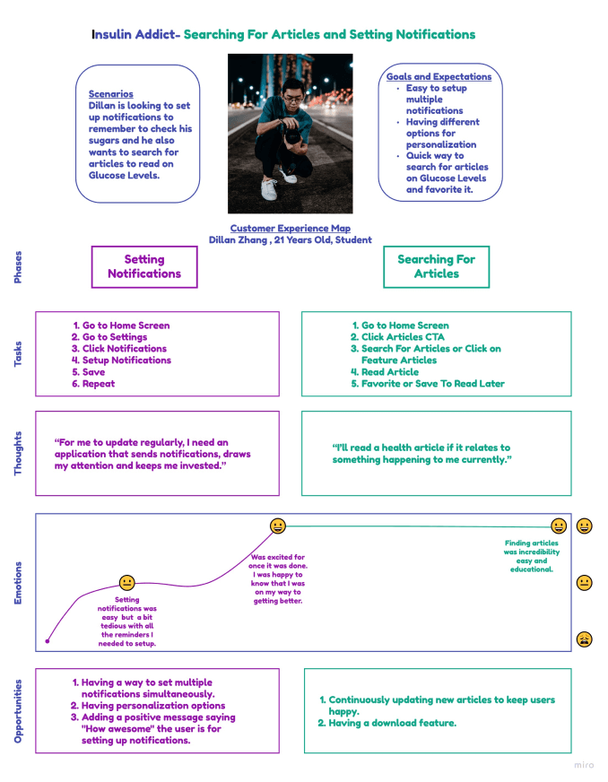
Dillan User Journey
User Flows
Having completed the personas and user journeys, we were able to create detailed user flows for the main features of the app. They specify the steps of how the user can get from the start to the completion of their goal, and any decisions that they have to make on the way. Below there are three user flows mapped out to showcase the main features of the app.
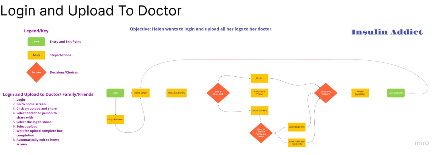
User Flows
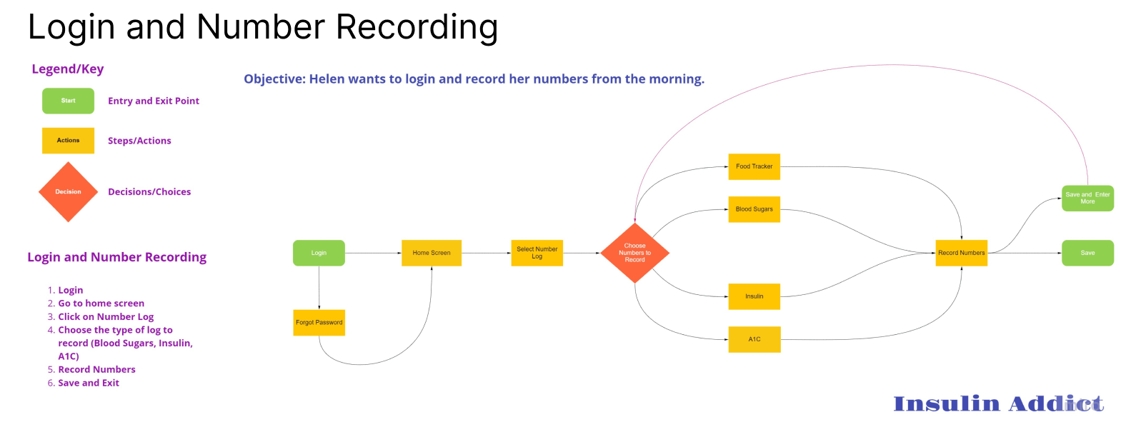
User Flows
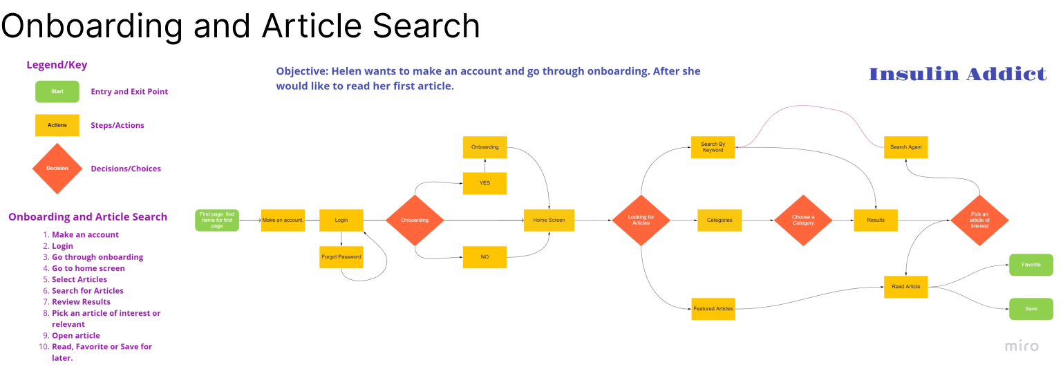
User Flows
Design
At this stage of the project, we focused on Information Architecture, defining the sitemap and mapping all the content and navigation structure of the app. Having done that, we created wireframes for each one of the user flows showcased above. Starting with sketching low-fidelity wireframes that outlined the critical features of the app, moving to mid-fidelity wireframes in Figma until creating high-fidelity screens and clickable prototypes to flesh out all the details of each screen that represents main user flows.
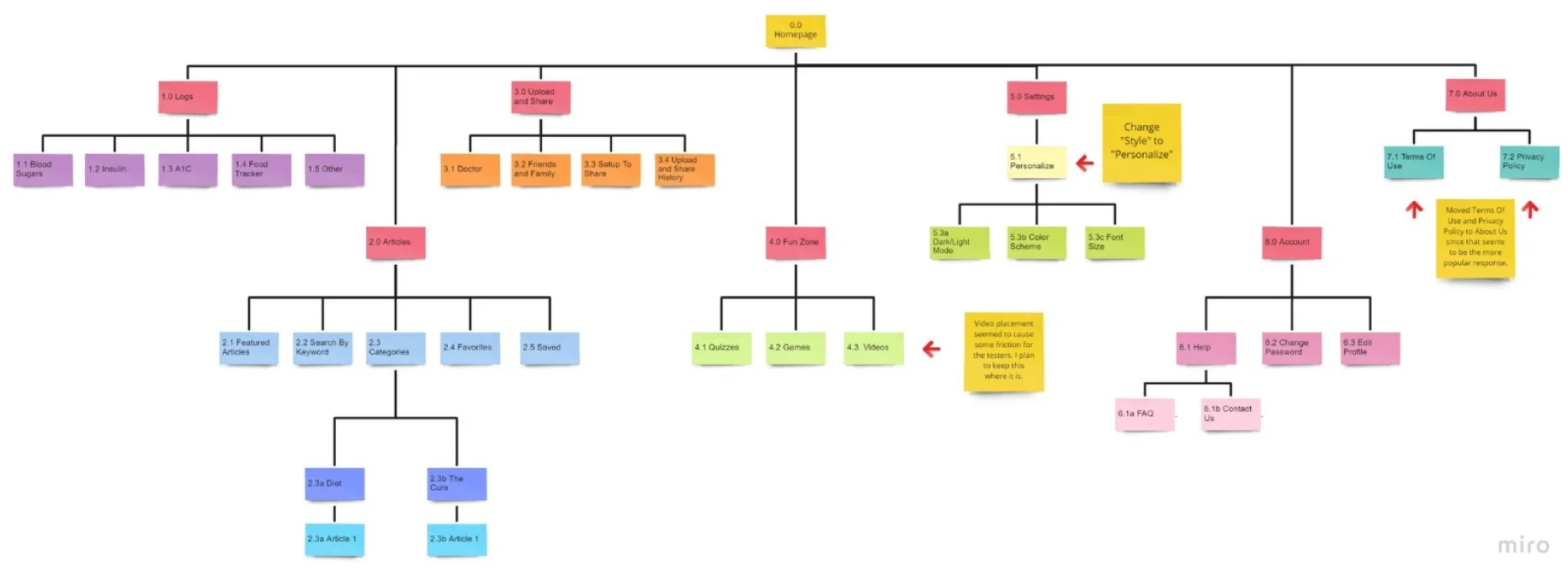
Before creating a low-fidelity wireframe, we made a sitemap to figure out the content hierarchy of Insulin Addict. This became a reference point to aid me in constructing the wireframes. We created an initial sitemap that represents all the content in the app. We conducted a card-sorting exercise with 9 participants to validate my assumptions and made changes based on their feedback accordingly. Below we're showcasing the final sitemap, with the changes highlighted on yellow post-its.
Sitemap and Information Architecture
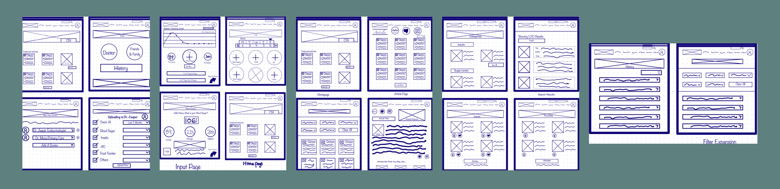
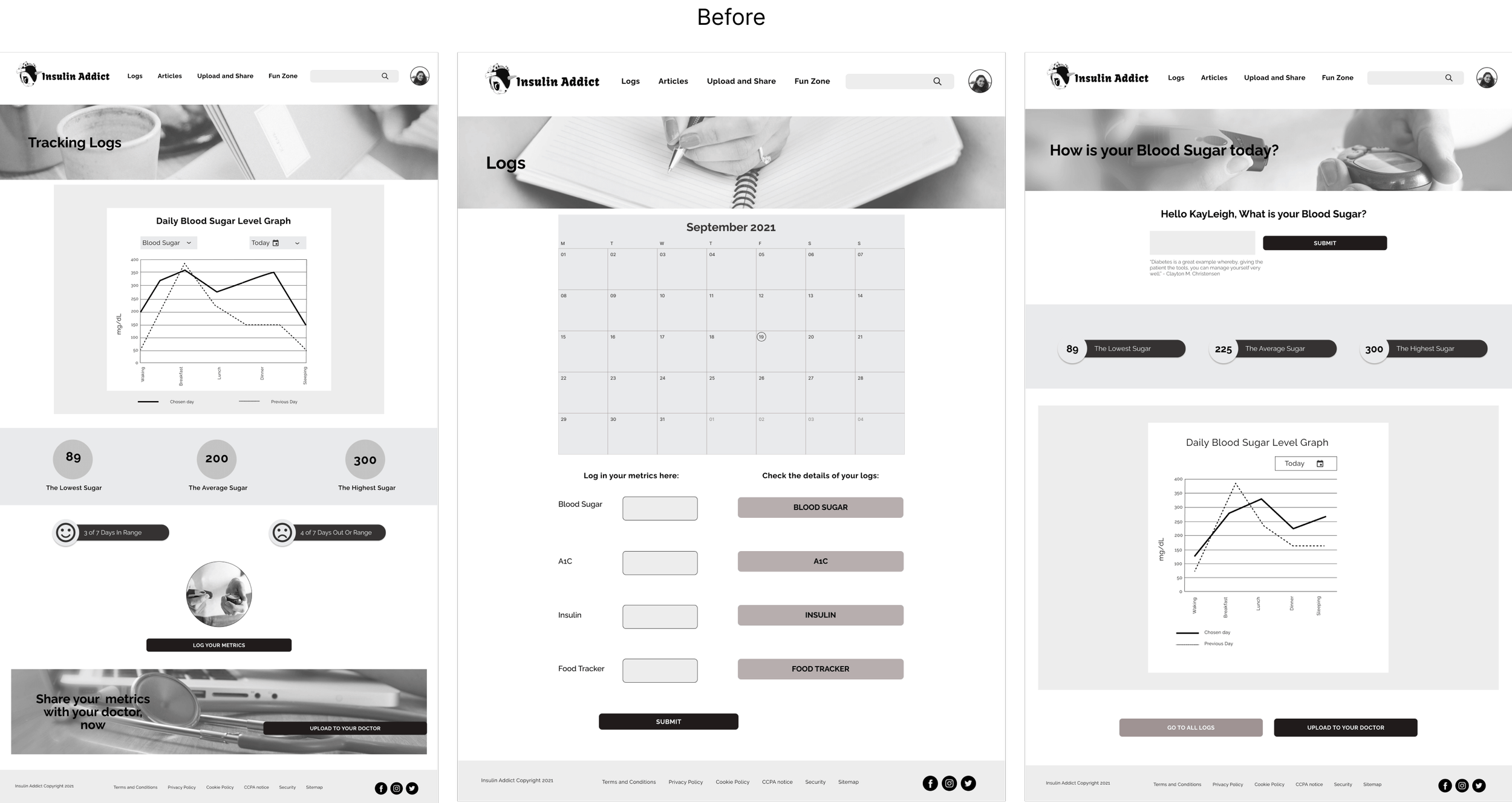
The low-fidelity wireframes were first sketched on an iPad and then designed in Figma. We chose 3 core features (Log Metrics, Upload and Share to Doctors/Friends and Family, and Articles) to create and included wireframes that helped to get to these features. Displayed are the low-fidelity sketches and Figma designs.
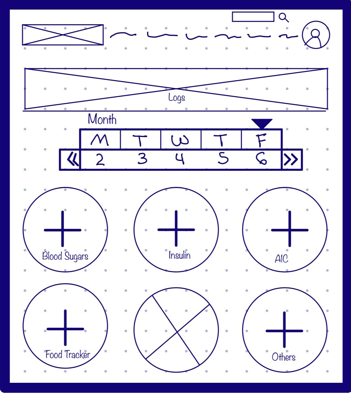
Low-Fidelity Wireframes
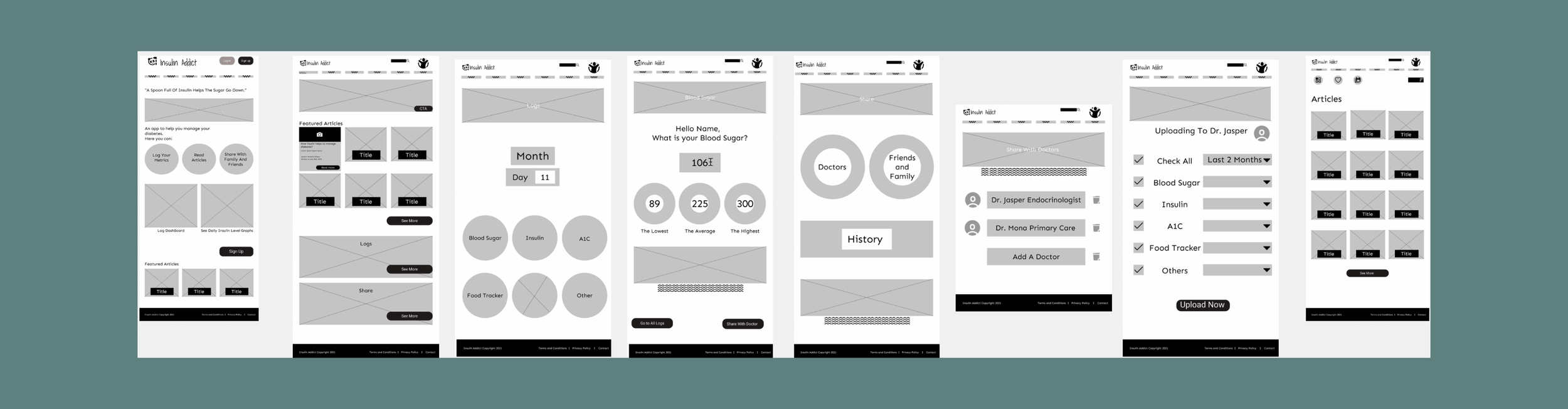
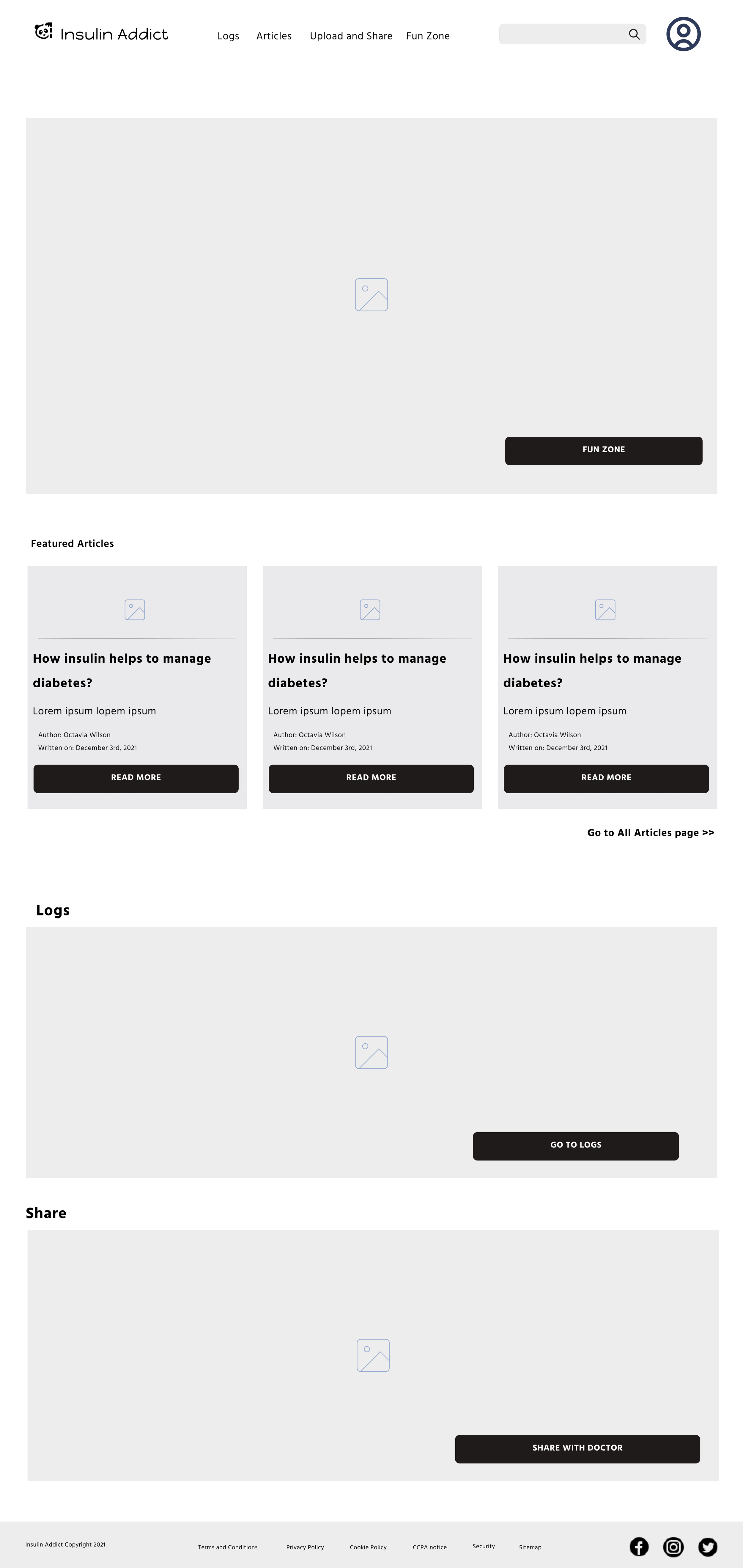
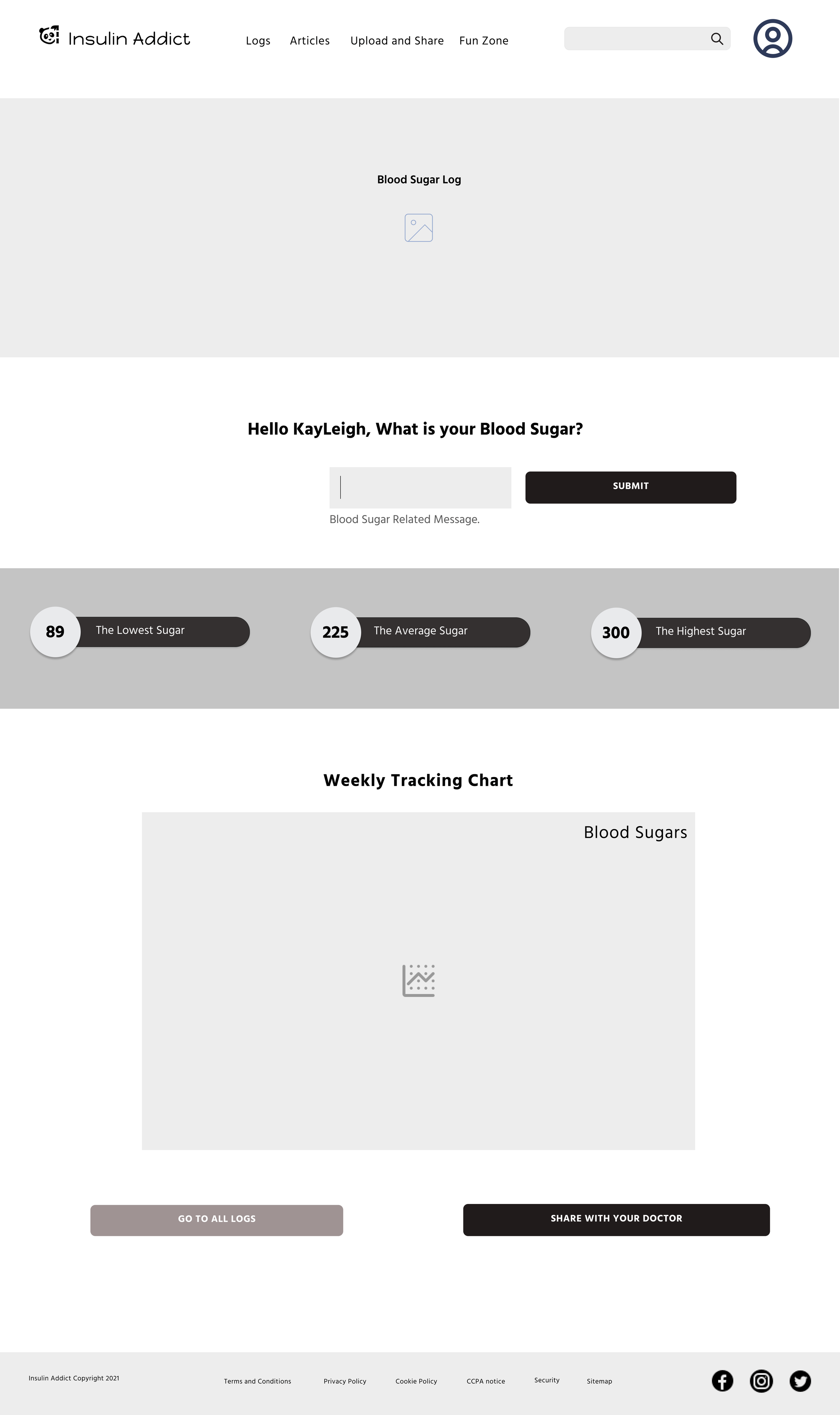
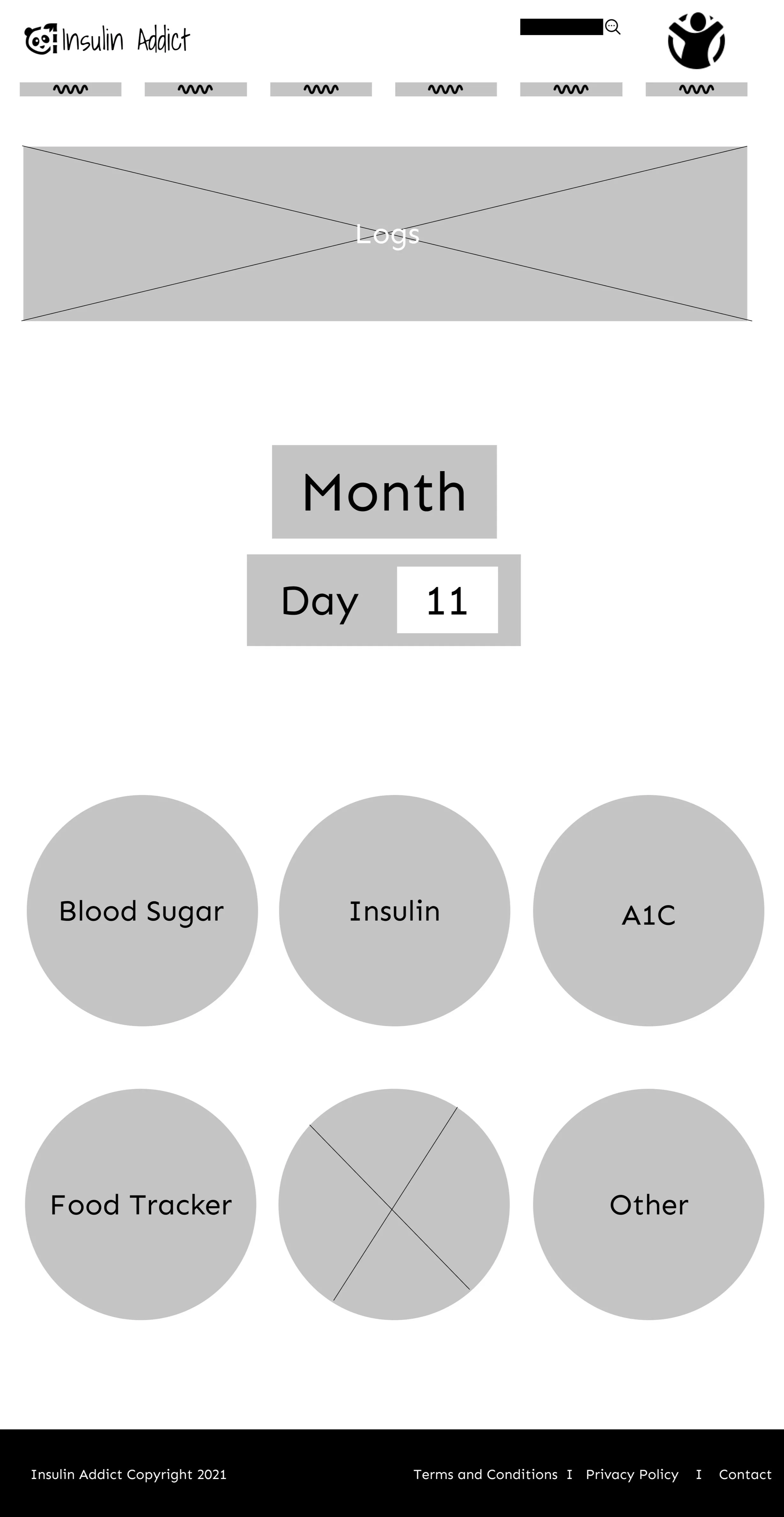
After the sketches were converted to low-fidelity wireframes we started designing mid-fidelity wireframes. The mid-fidelity wireframes were built in Figma and we started adding more details to the frames while keeping the user in mind. We started adding icons and placeholders for images and graphs. Below are some of the mid-fidelity frames we created.
Mid-Fidelity Wireframes
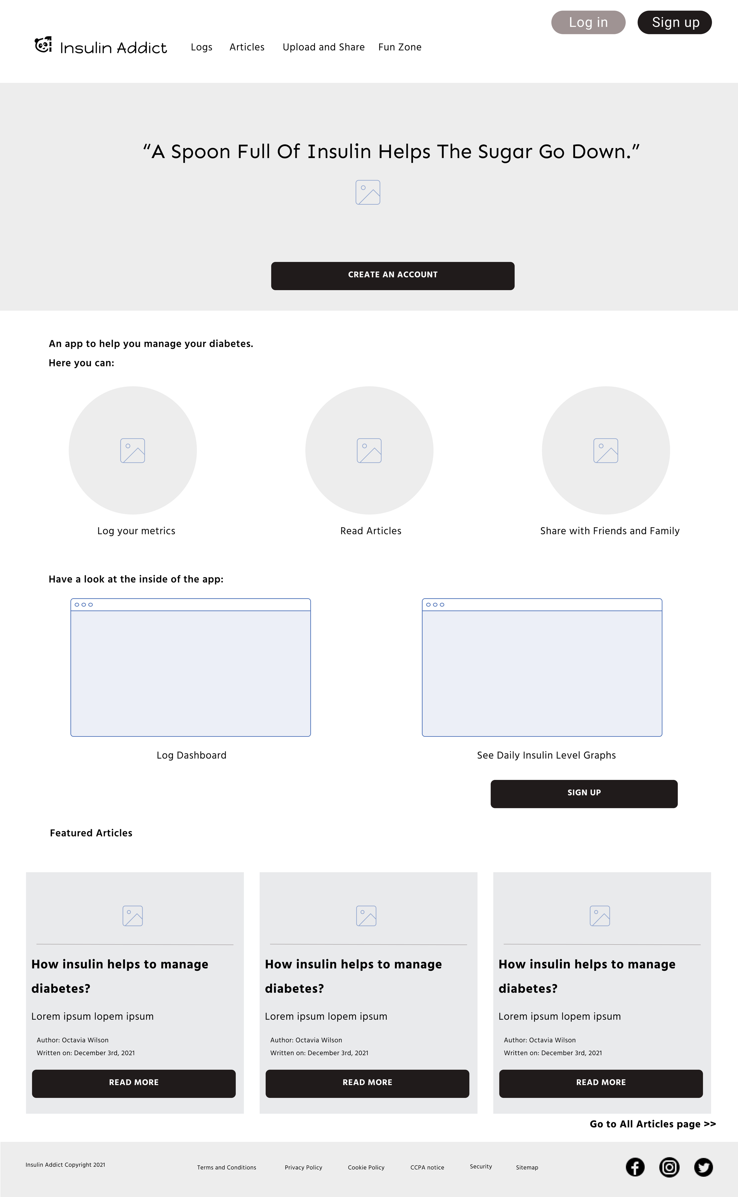
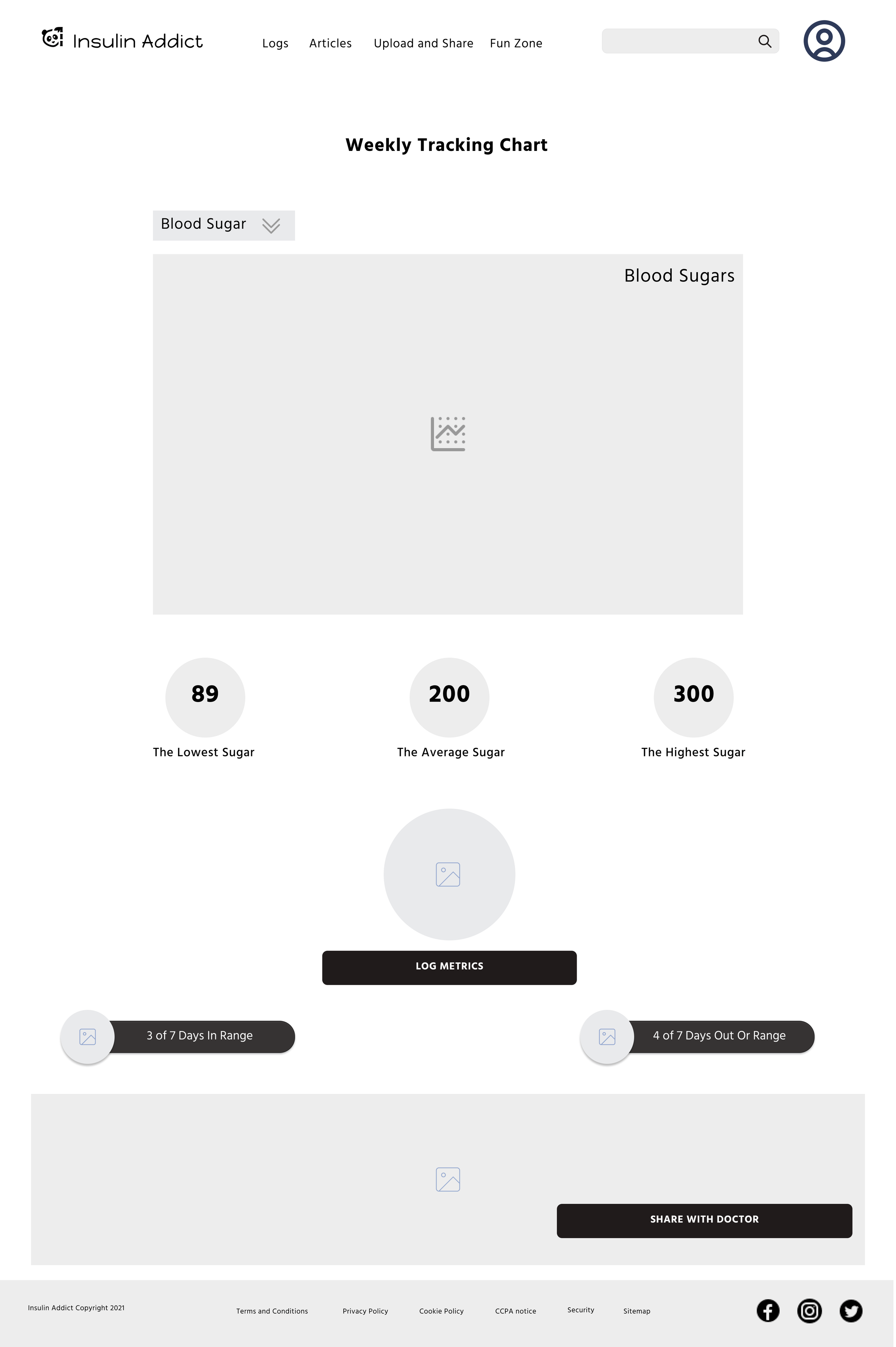
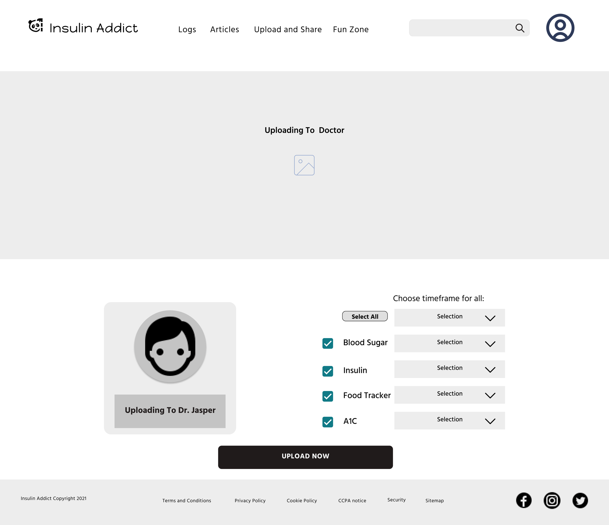
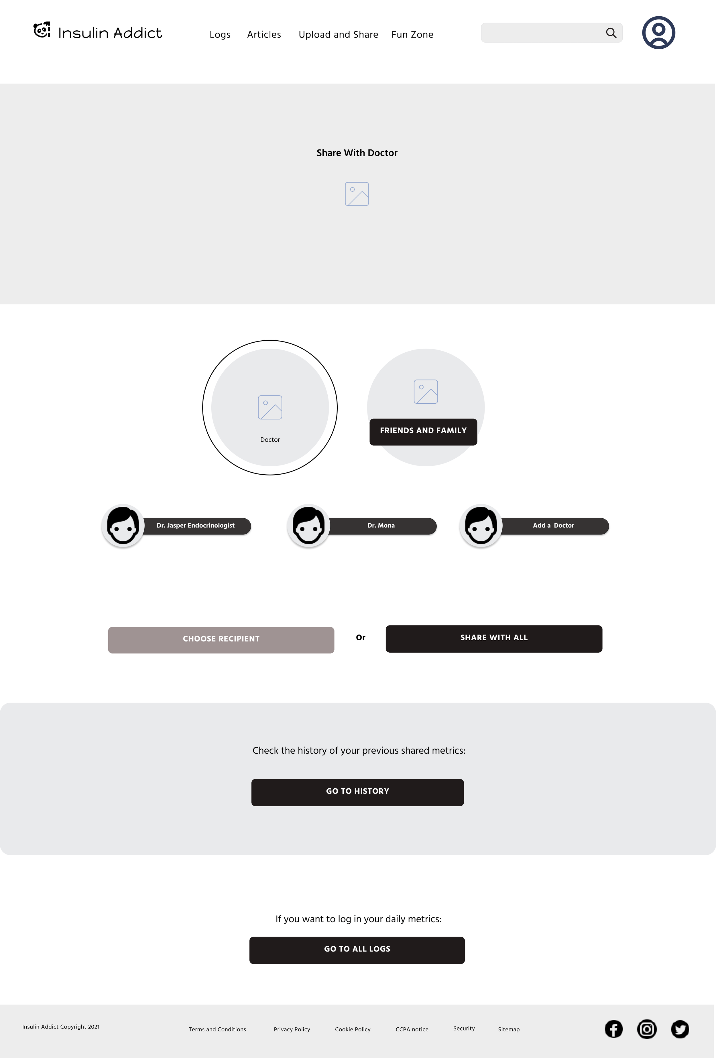
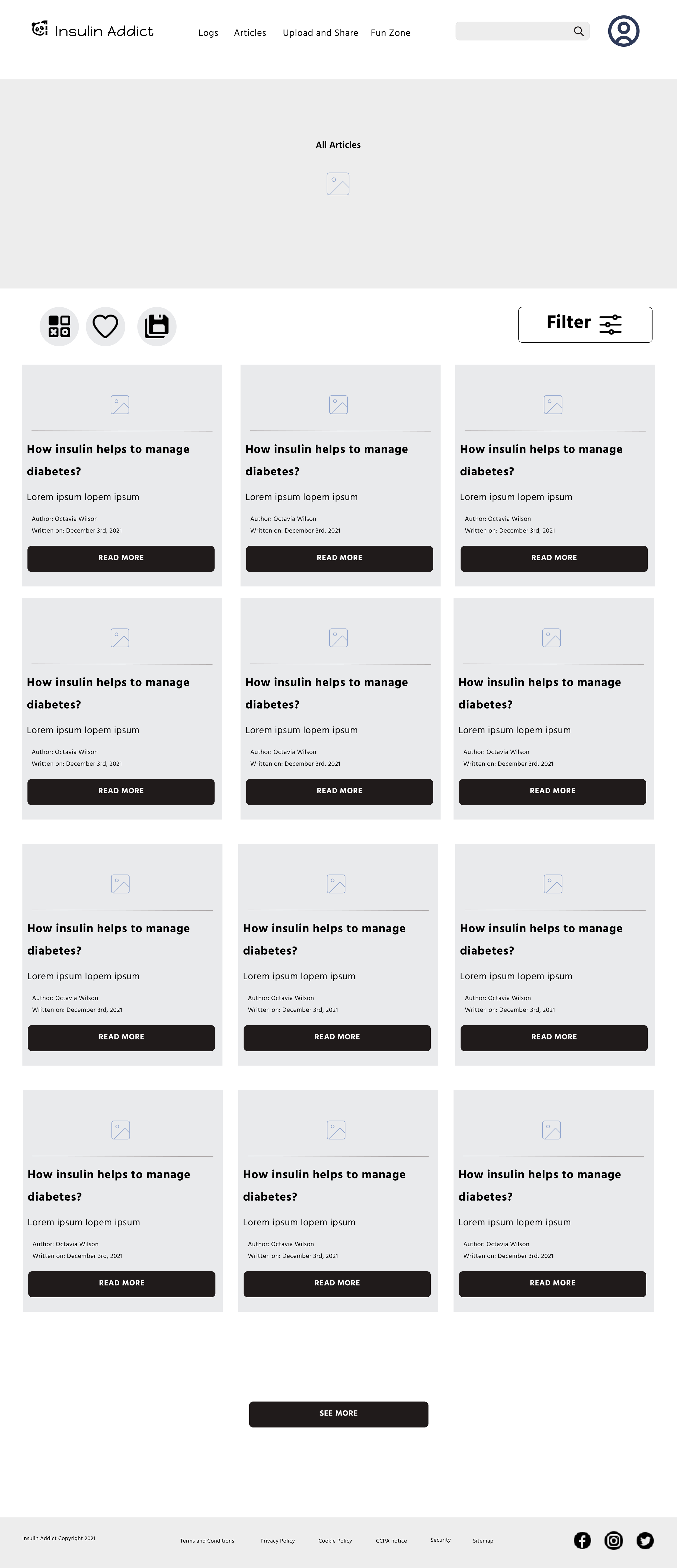
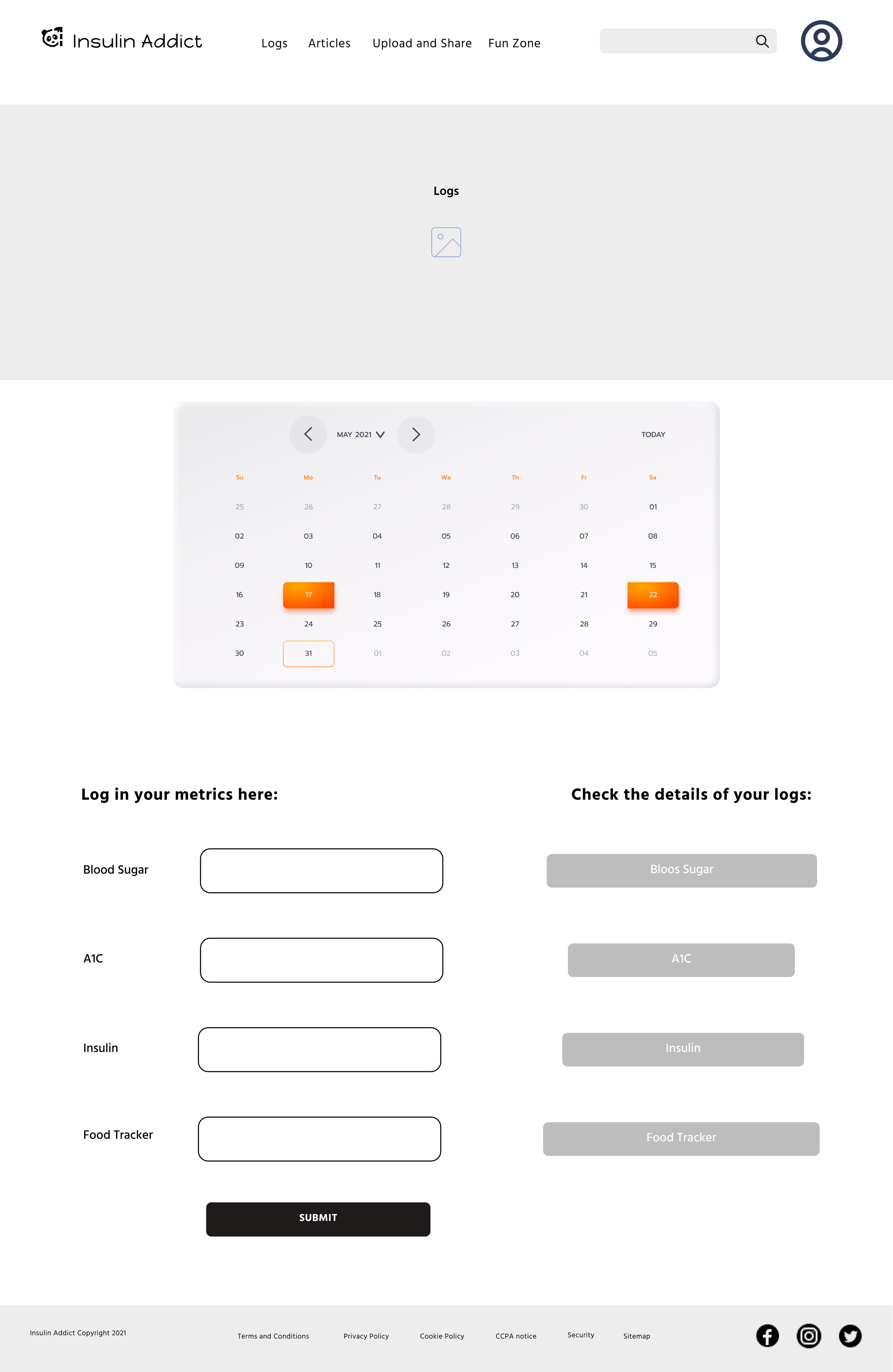
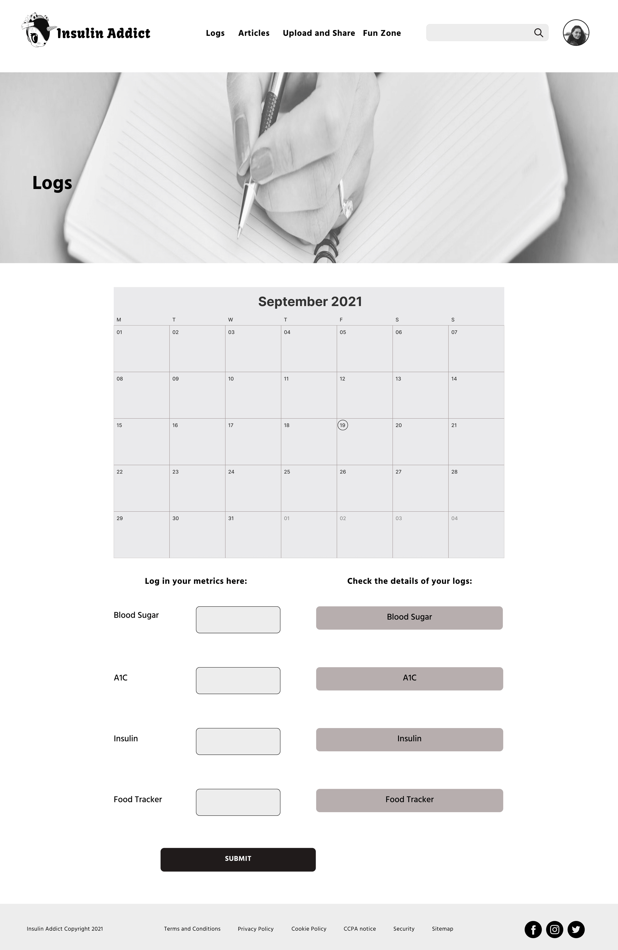
High-Fidelity Wireframes
The next step was revising the mid-fidelity wireframes into a highly detailed representation of Insulin Addict. At this stage, we were focusing on finalizing all the details of each screen, to flesh out the main user flows, add the final typography hierarchy and navigation patterns.
For each one of the main user flows and as a result for each one of the app screens, we followed the process starting with sketches outlining the main purpose of the screen and the crucial elements that will allow the users to fulfill their goals. From there, we moved to create low-fidelity prototypes in Figma - great boxes were meant to best represent the information hierarchy, main components on the screens, and ways of navigating between them.
Next, we added more details around the elements with mid-fidelity wireframes. Afterward, we turned all the screens into high-fidelity wireframes that reflected the final UX of the app, including all the details of each component, typography hierarchy, and navigation patterns.
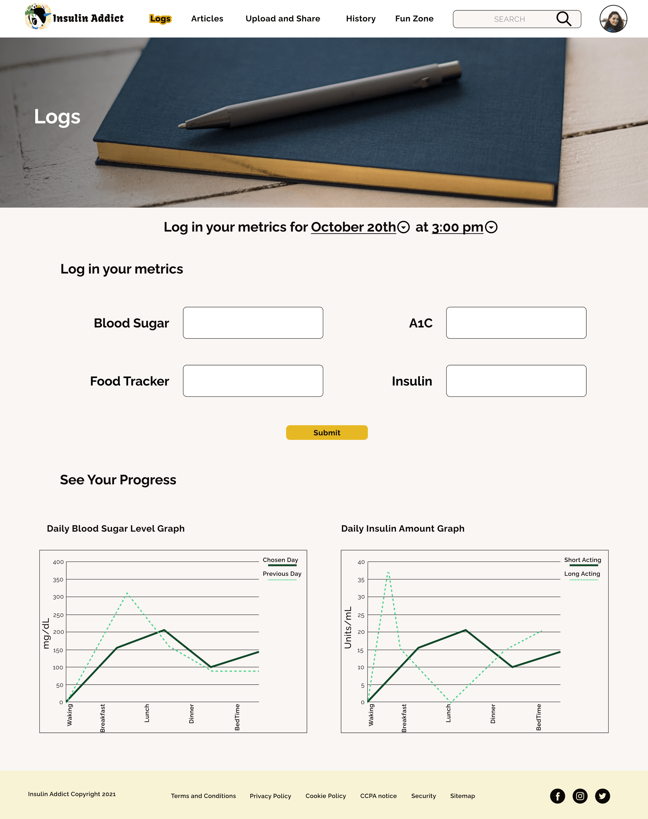
Finally, we moved to the UI Design phase, where the added color palette, imagery, and iconography to best reflect the app's personality and respond to our target audience.
Fidelity Evolution: Sketch to High-Fidelity Wireframes
Sketch
Low-Fidelity
Mid-Fidelity
High-Fidelity
UI Design
Test and Iteration
Usability Testing
Having created a high-fidelity prototype, this is the time when we put it in real-world users' hands to observe how they interact with it and identify all potential pain points, which would allow us to iterate and refine our prototype.
Test Plan
Before conducting the Usability testing for Insulin Addict we had to figure out a plan of action to ensure nothing gets overlooked and the day of testing runs smoothly.
The test plan helps us to define the goals and objectives to allow us to make sure we stay on track while we conduct the sessions. It will also include participants' criteria, schedules, etc.
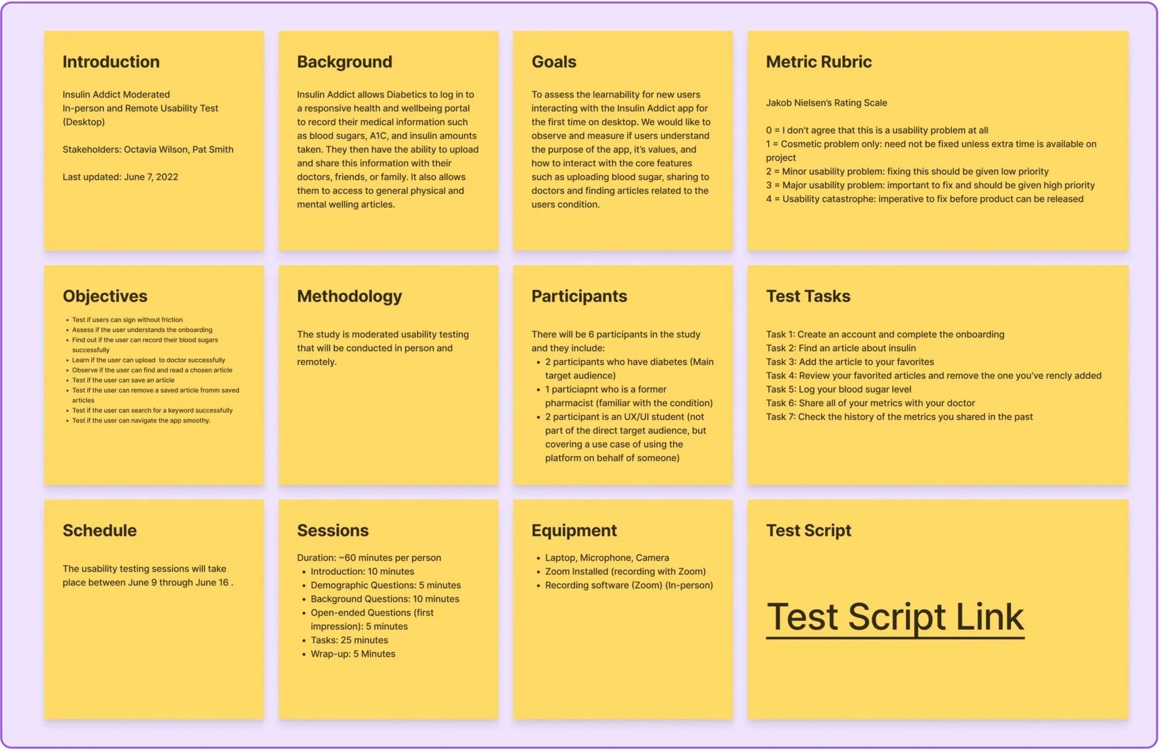
Test Script
After completing the test plan, we created the test script to allow us to follow the same scenarios with all the participants, to ensure the data is comparable. The test script includes tasks to follow for the users in order to achieve their goals, and allows us to observe whether the current UX of the app enables them to do that smoothly and without friction.
Conducting the Usability Testing
We conducted the usability tests in person for all 6 participants. The sessions were recorded and we made notes on their body language while completing the tasks to ensure nothing was missed.
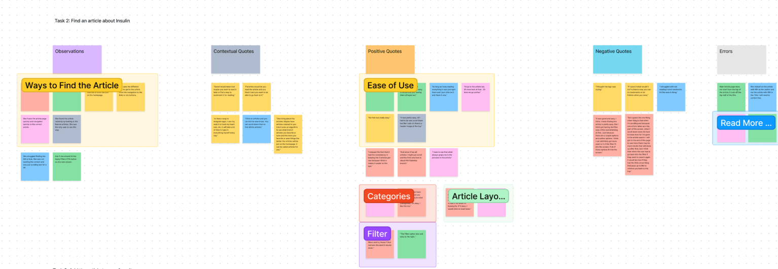
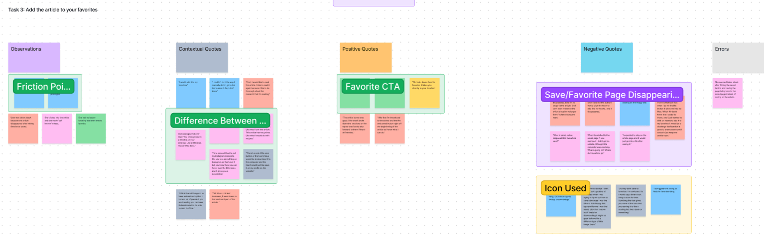
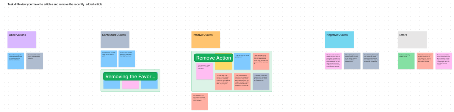
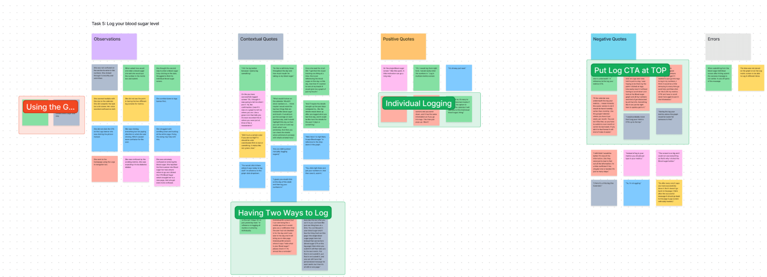
Affinity Mapping of the User Testing Results
Next, we created an Affinity Map of all the comments and captured behaviors of all the users. Once all the comments were organized into each task we grouped them into Observations, Contextual Quotes, Positive Quotes, Negative Quotes, and Errors. Next, we created affinity maps based on the similar comments and behaviors.
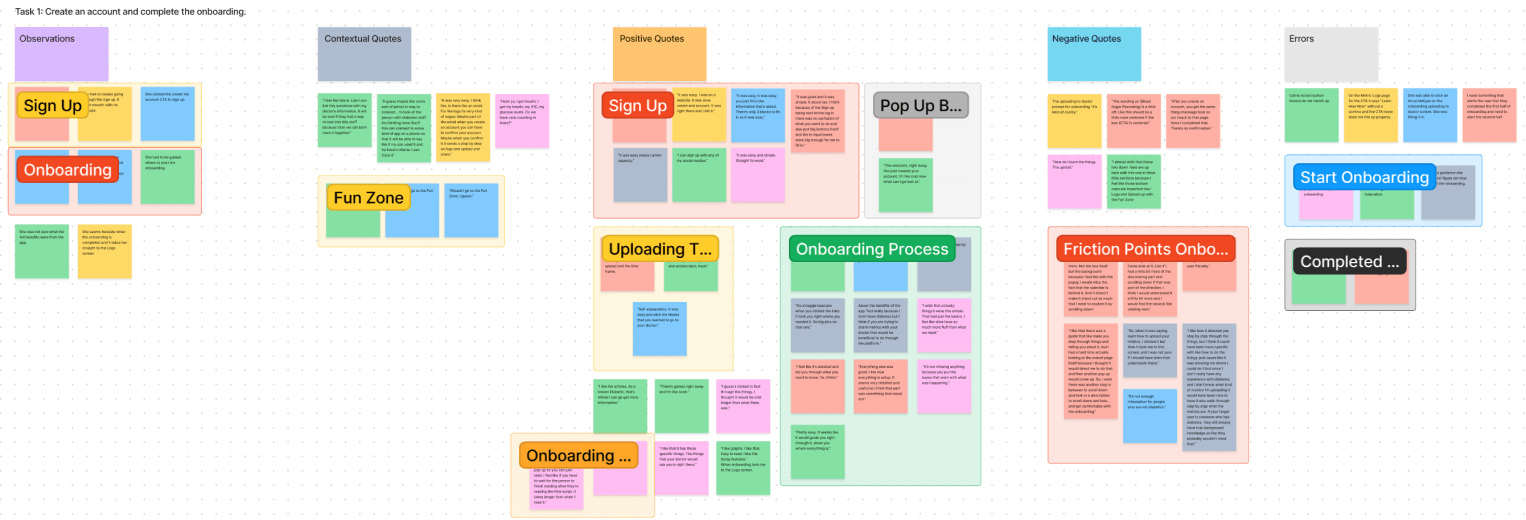
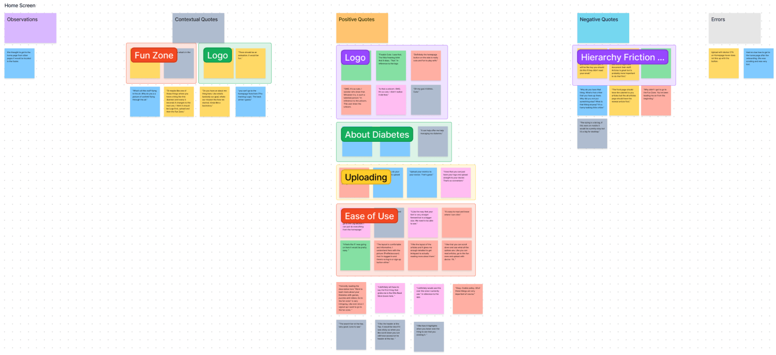
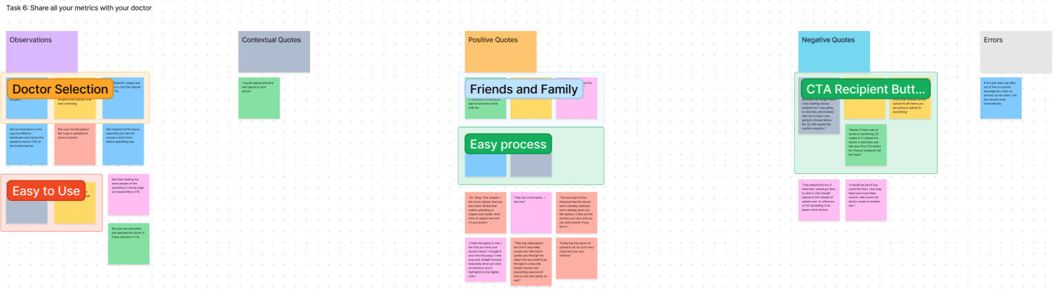

Findings
The user did not know that Onboarding was completed as there was no message to show completion.
History was hard to find as it only was placed on one page at the bottom to access it.
Logs had a lot of extra screens from the landing page to the individual metric screens. Users that there were too many steps to log their metrics.
The user did not agree with the hierarchy on the homepage and the Logs screens.
The scale of the entire app was too large for desktop devices.
Design Iterations
Having completed Usability Testing, we were able to capture the main friction points that the users experienced. We used Rainbow Spreadsheet to prioritize the issues and applied the changes to the prototype to reflect the improvements.
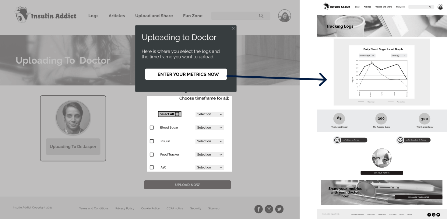
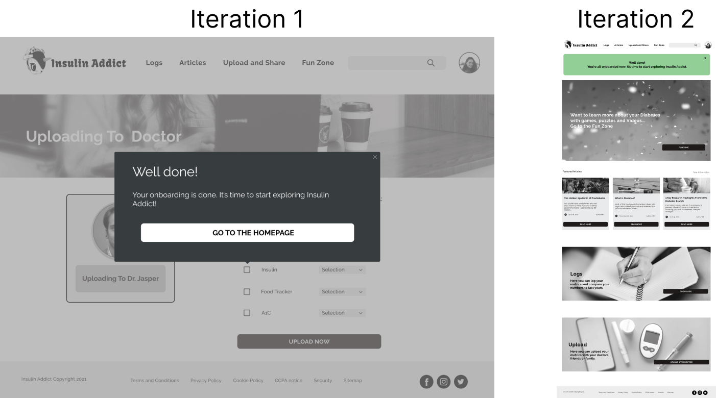
Issue 1: Where to go after onboarding? (High)
User’s Reponses
P1, P5, P4, and P6 stated:
[Error Severity Scale: 3]
The onboarding screen is hard to see where to start. Onboarding is set up to start at logs but no indication.
I need something that alerts the user that they completed the first half of onboarding and need to start the second half.
Did not know where to go after the onboarding.
Solution
Adding a popup box stating that onboarding is complete for the first half or having a pop-up lead them to start the second part of onboarding. Once onboarding is completed add an "Onboarding completed" message and have them know they can explore freely. Also having the Onboarding end on the Homepage.
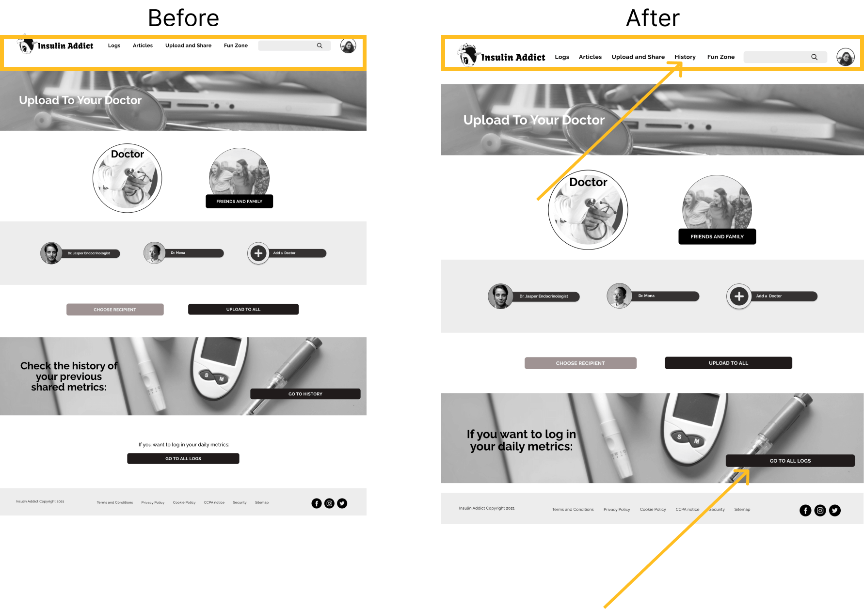
Issue 2: How to find history in the navigation (high)
User’s Reponses
P2, P5, and P6 stated:
“You go to Upload and share to upload and share. history does not seem like it would go there. I mean it would just if you scroll down but just keep it simple and to the point. Upload and share should just be upload and share. “
Solution
Add History to the navigation bar and/or add it to the profile screen. Can add a clickable banner similar to logs and upload it to the doctor.
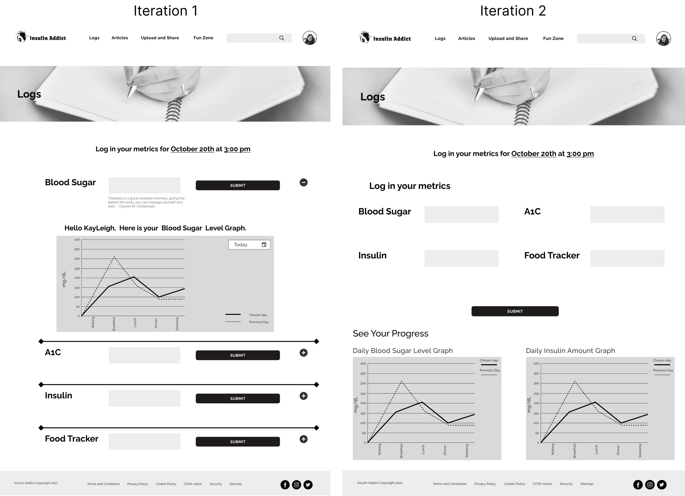
Issue 3: Simplify how to capture logs, two screens were confusing for the users (high)
User’s Reponses
P1, P4, and P6 stated:
“I still think it would be better if it was all the information. Like they were just to lead to feeling out all the information. I'm a little conflicted if the singular one is needed. It’s just too many steps.”
“Is there a reason you only need to log one metric at a time? I wonder if instead of having them all here like this but after you put it in you can have like just one thing here at a time. You can like put in your blood sugar and it has the thing that’s on this page (the single blood sugar page) here but instead that can be here (blood sugar CTA on the log page) then when you submit it will then take you to the next metric. Put that in and submit it, put that in and submit it, and you can still have that personalized message for each metric but then it’s all still on one page.”
Solution
Remove the singular enter a blood sugar screen and combine it with the metrics page where all the metrics can be entered.
Preference Testing
After completing the test report came preference testing. The Onboarding and Logs screens had multiple layout choices that needed more user insight. We tested these two screens to see what the user prefers.
What Was Tested?
A preference test was created to test the best screen to place the onboarding message completed box. The options were placing it on the last screen of the onboarding screen or placing it on the homepage screen.
A preference test was created to test the best layout for the metrics log screen. The options were placing it vertically and having a drop-down arrow to view the graphs or having the graphs at the bottom only.
The Results
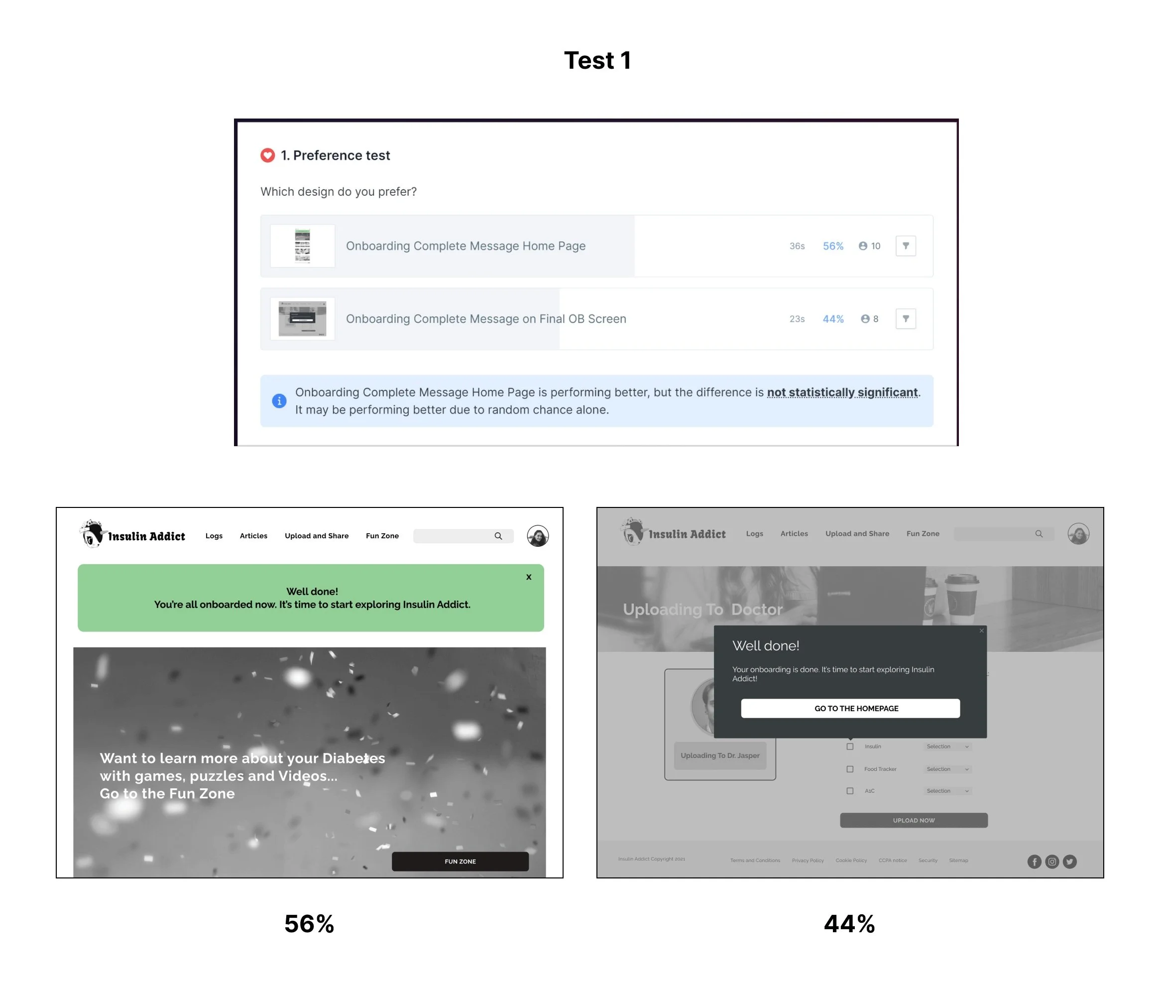
The results were very closely distributed, however option A was chosen (55% of participants), as users felt that the welcome message at the top of the Homepage is helpful to indicate that they completed the onboarding and can start exploring the app.
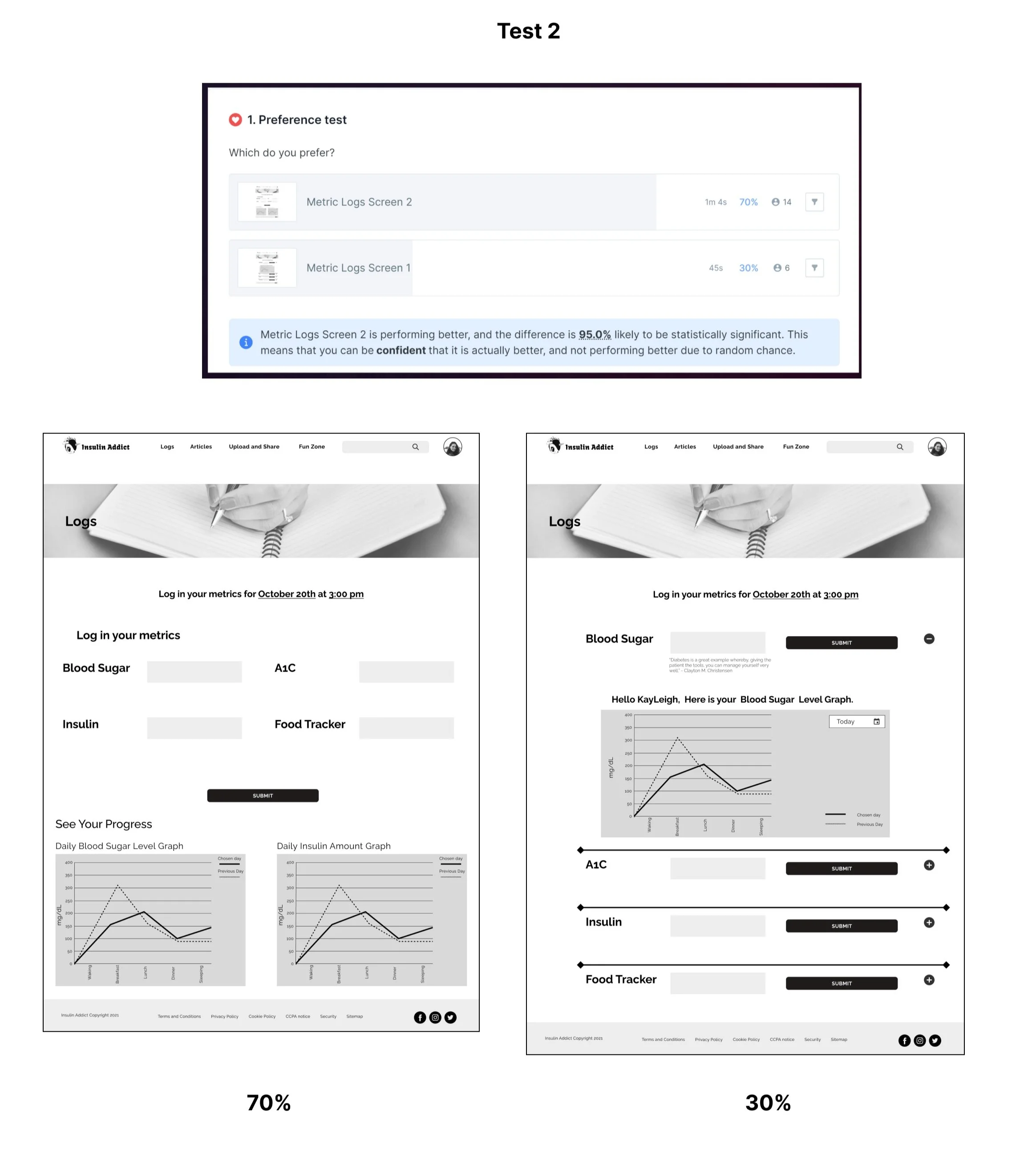
The results were option A. Option A was chosen (70% of participants), as users felt that having the graphs at the bottom of the screen and having all the metrics at the top for fast inputting.
UI Design
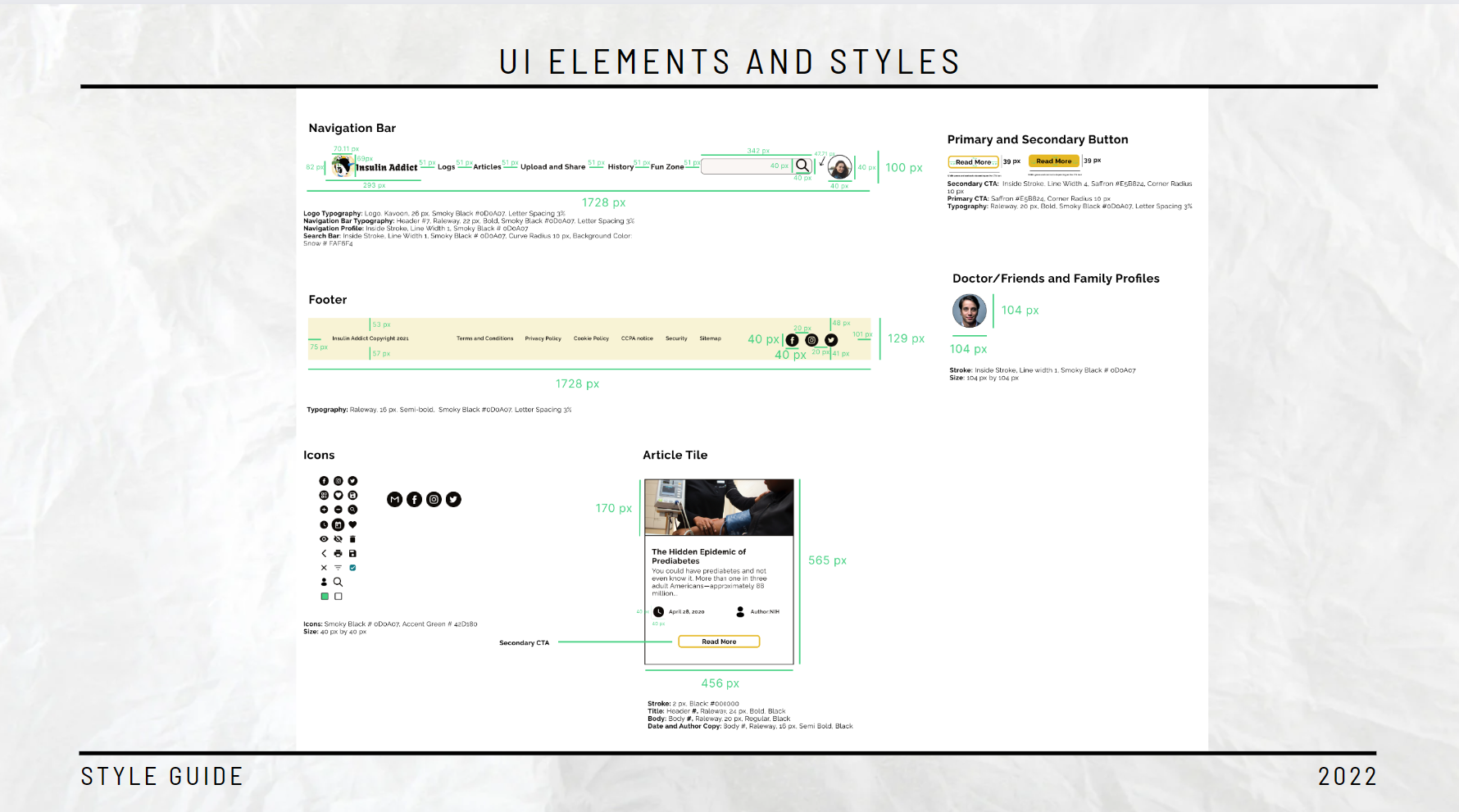
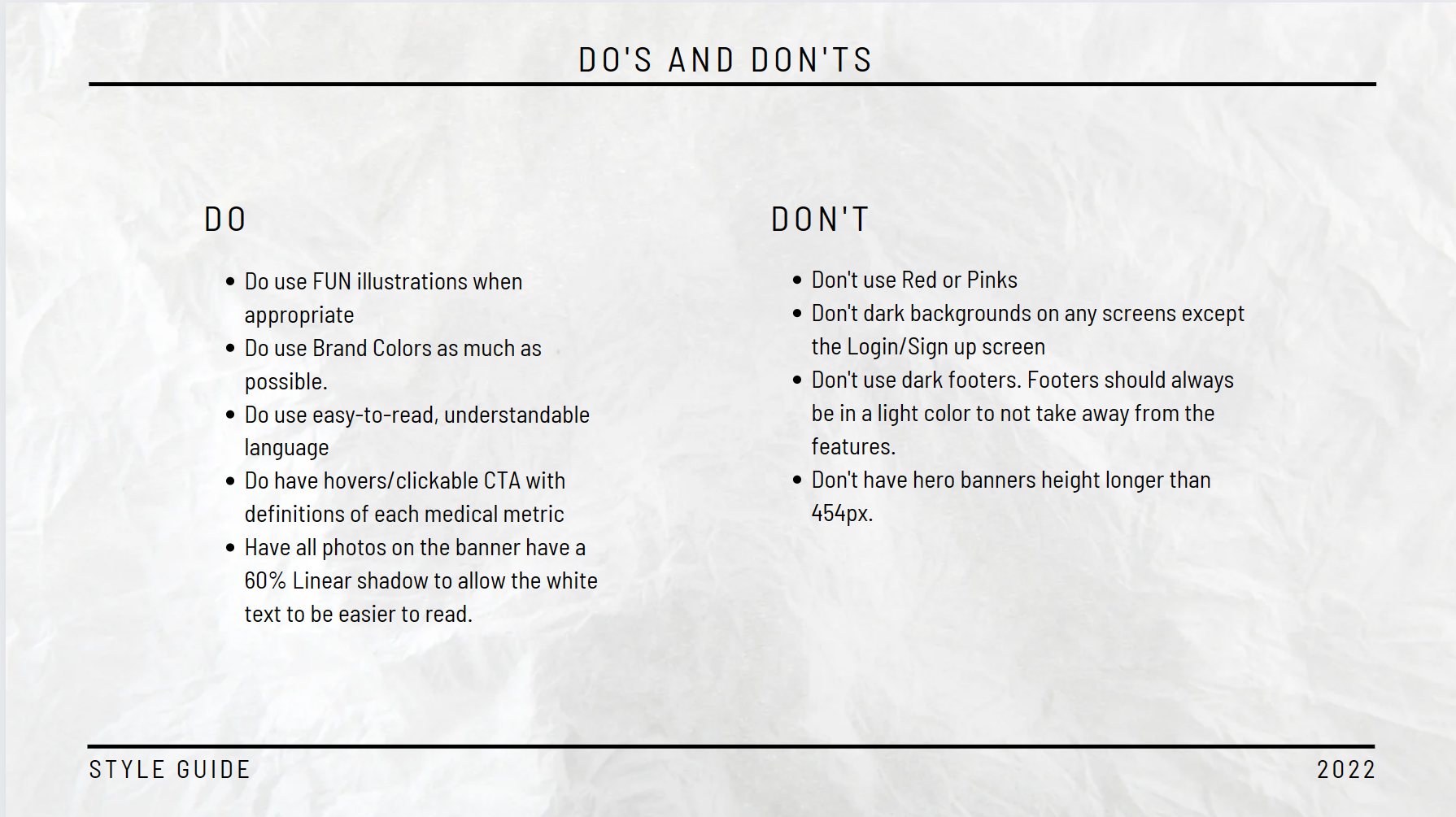
In the final phase of the project, we focused on UI design and putting the final touches on the Prototype so we can hand off the project to developers. It included the creation of the Design System that documents all the principles created for the Insulin Addict app, as well as the component library to allow scalability and consistency across the platform.
Final Design
Design System
Once everything was completed and the most updated prototype was approved we created our style guide. This guide broke down all the UI and UX decisions and laid them out in detail. This detailed breakdown will allow the next team to know actually what was to be coded to create the app successfully. It also creates a component library that other designers can use to scale and grow.
The main sections of the Design System included:
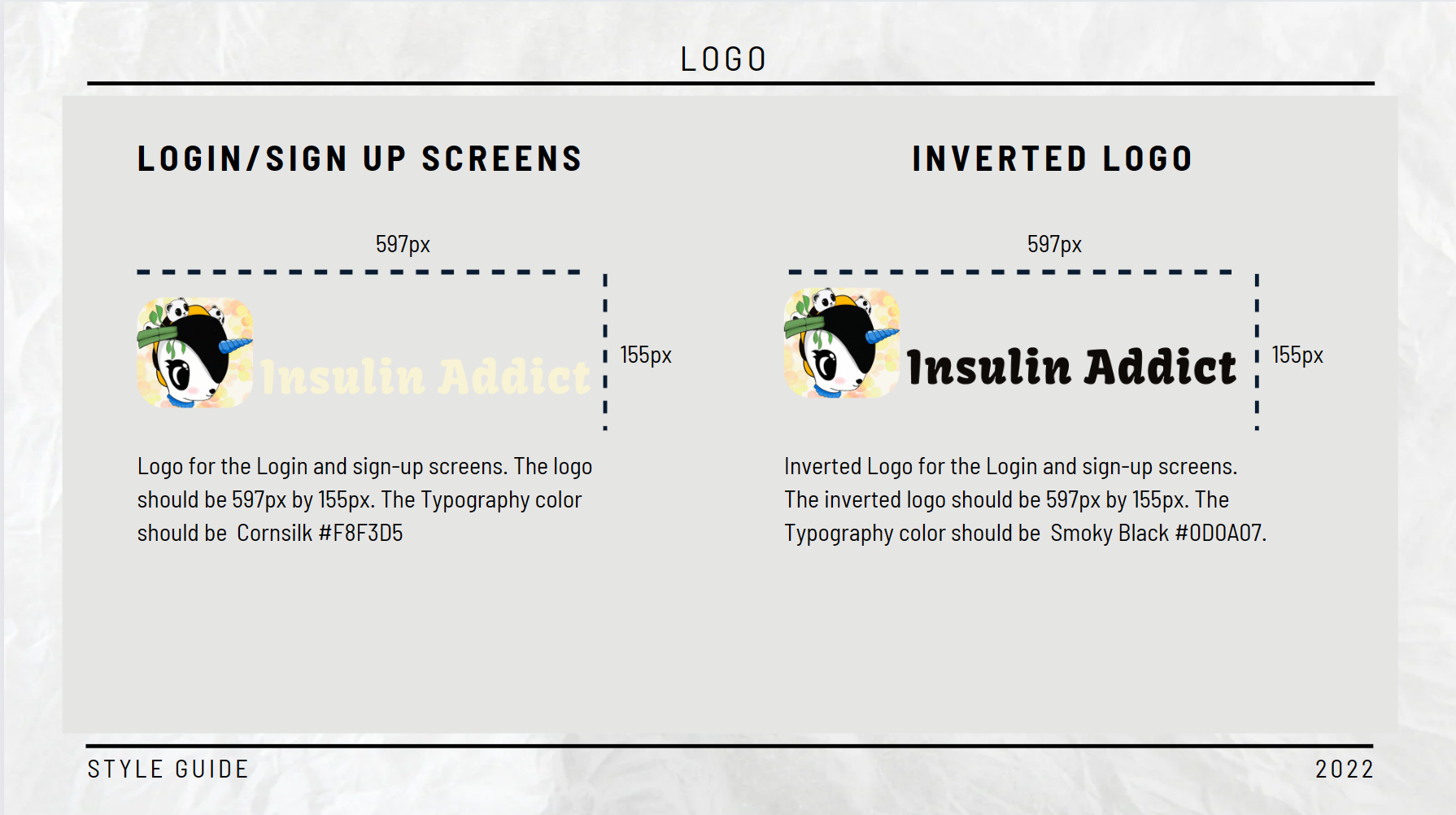
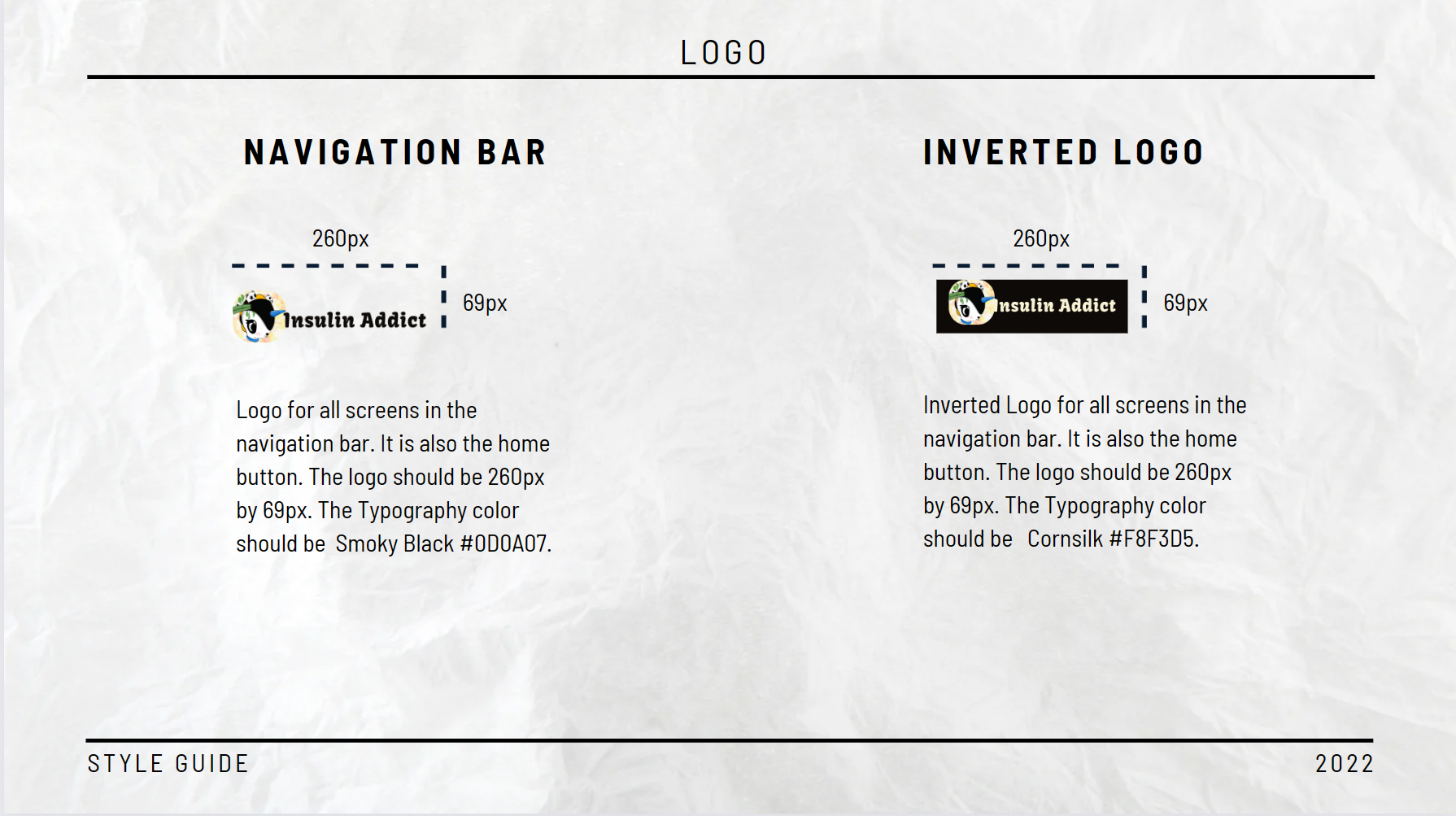
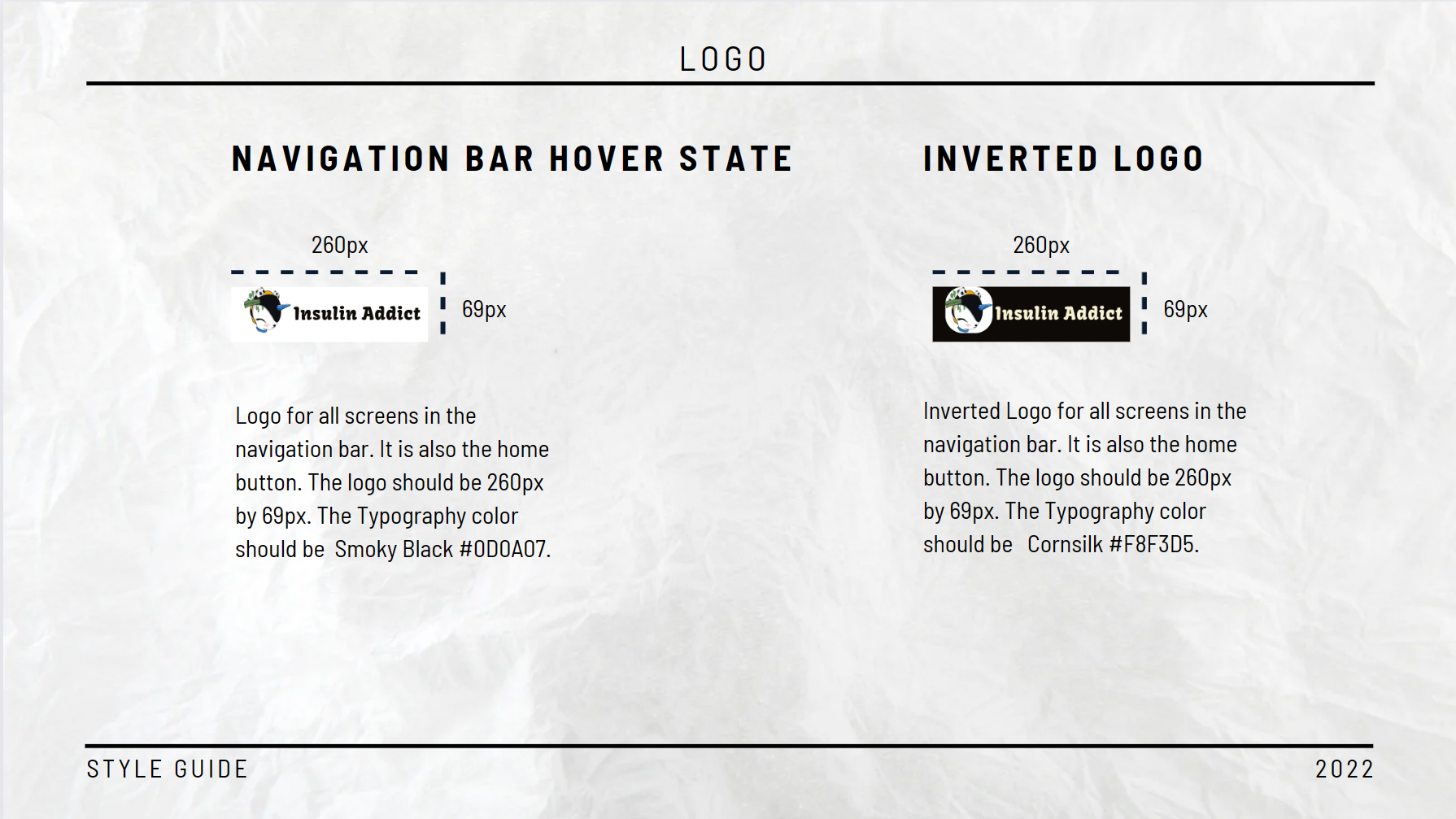
Logotype
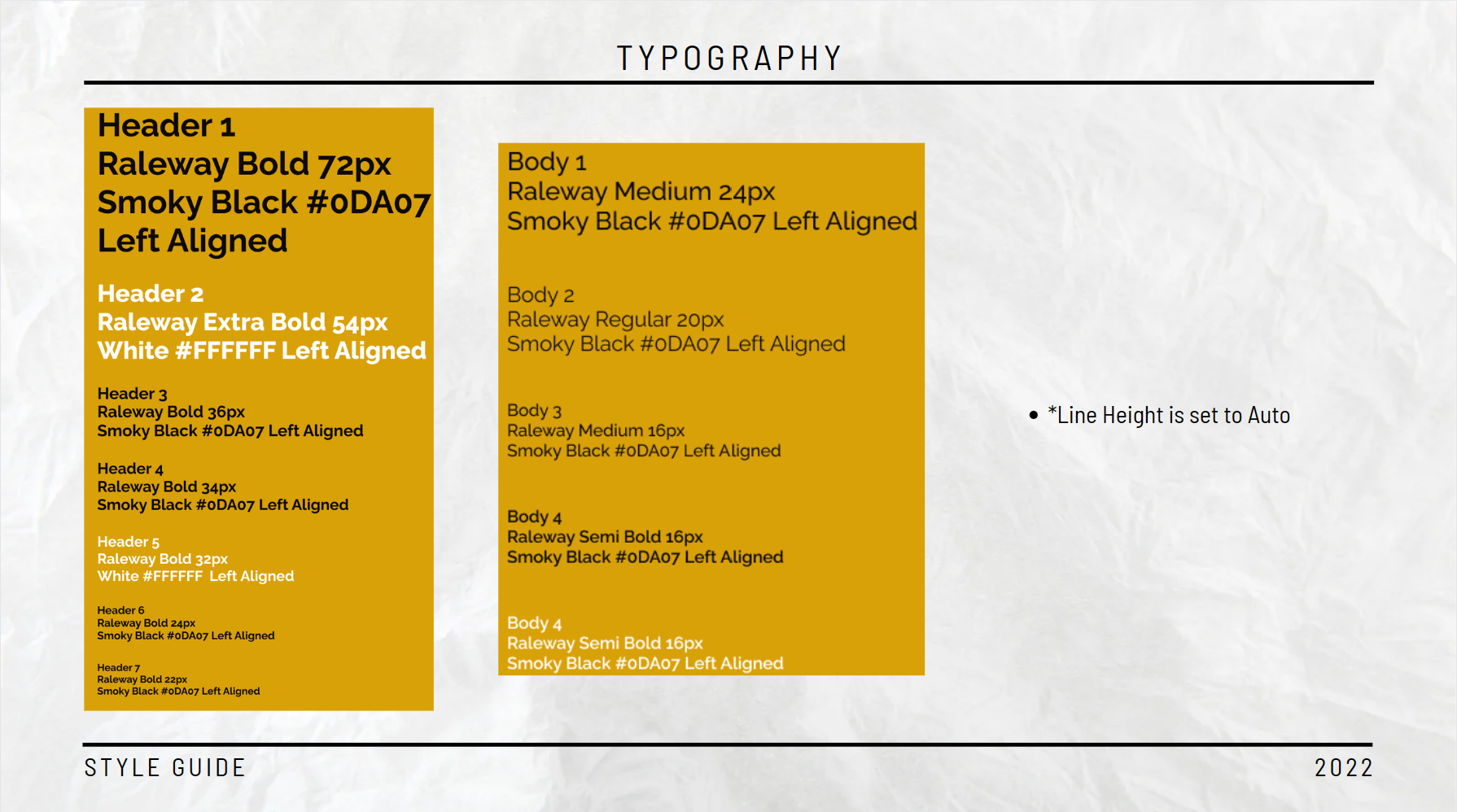
Typography
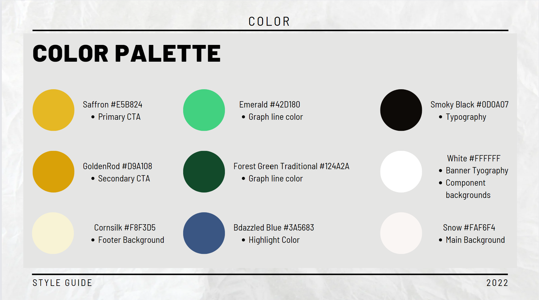
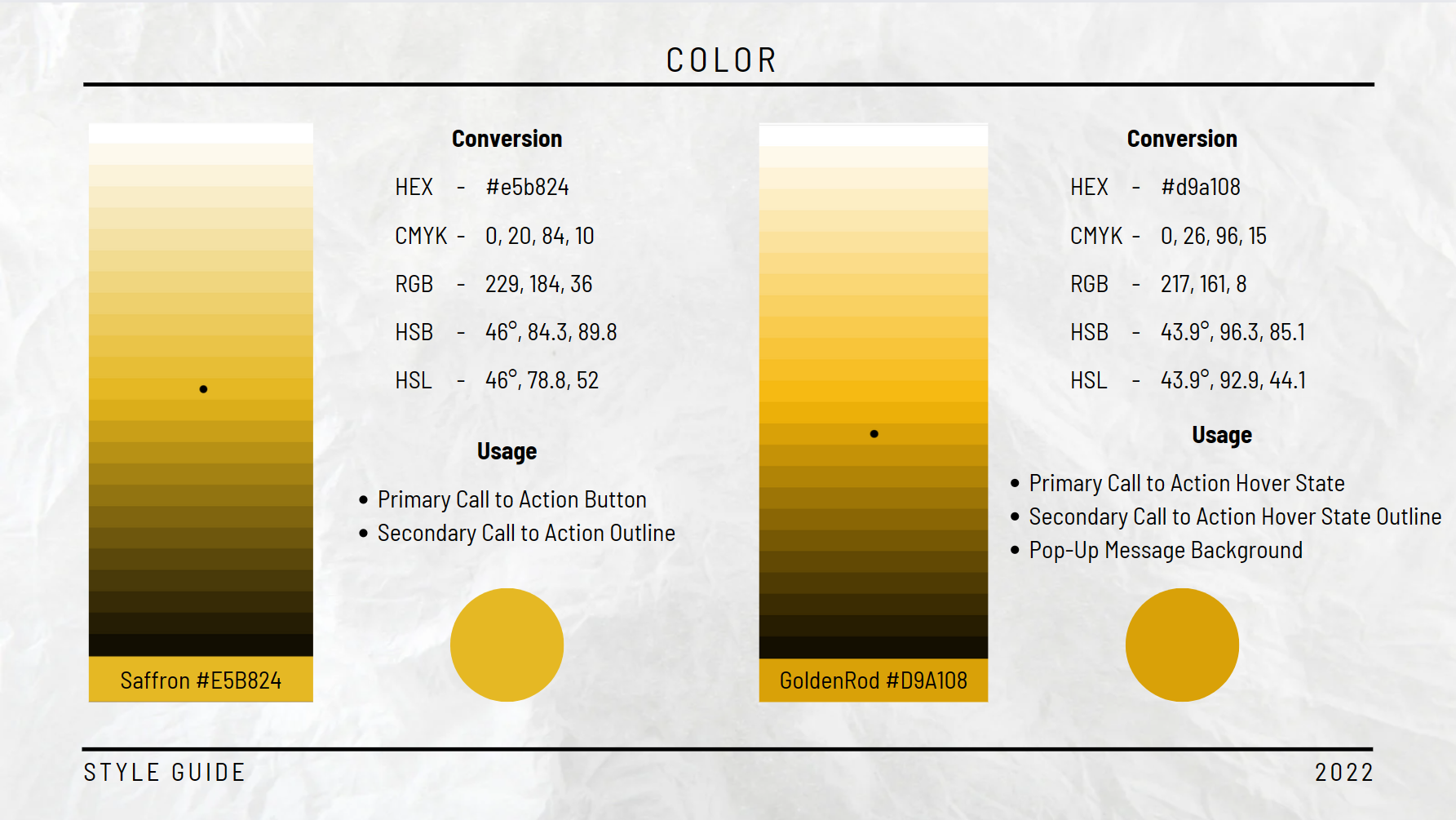
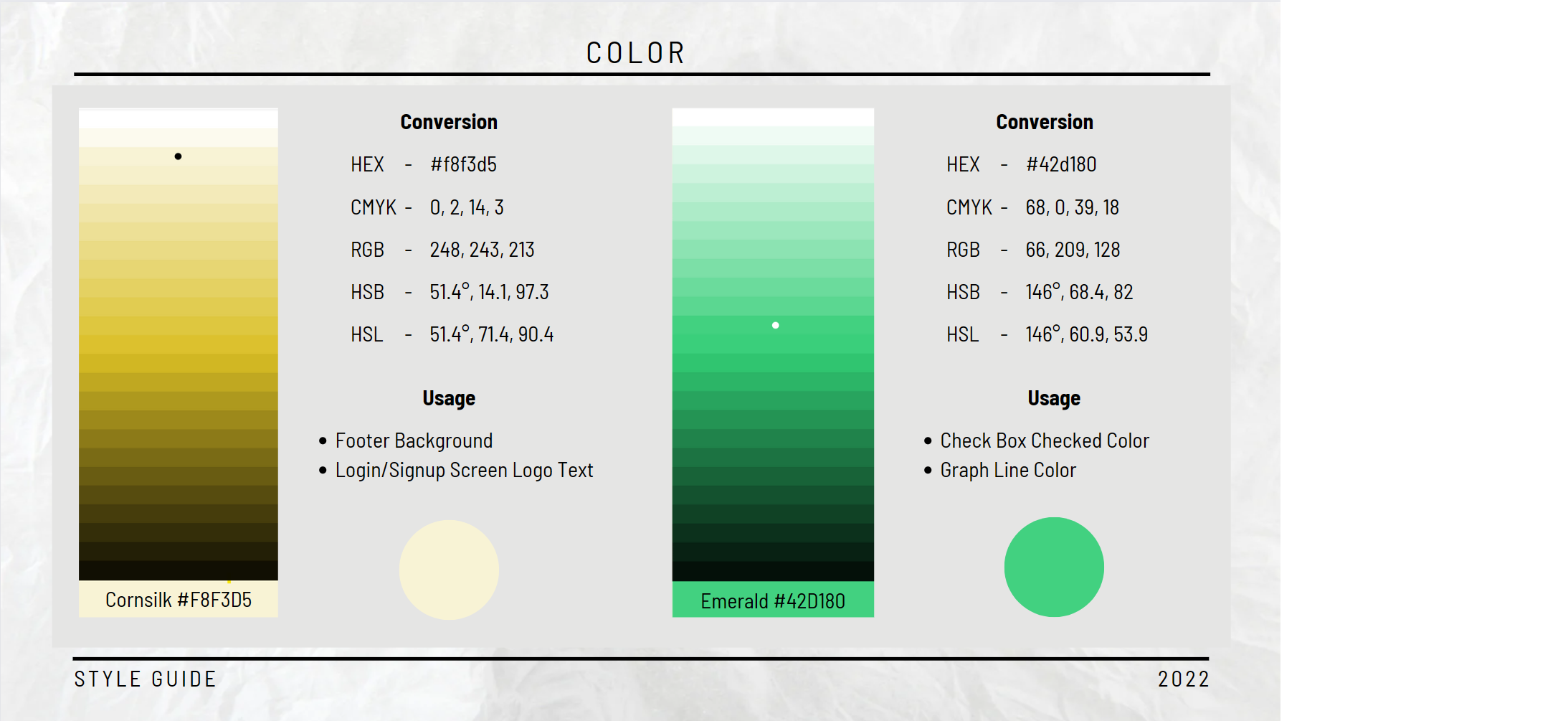
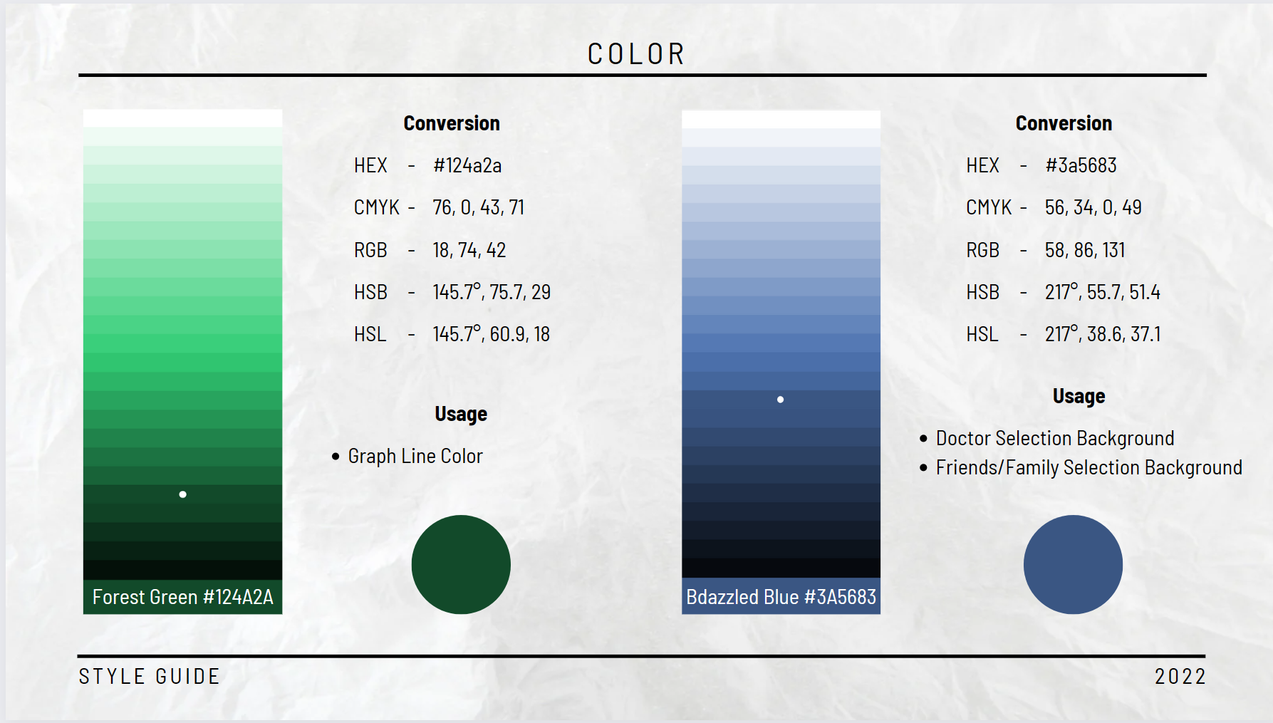
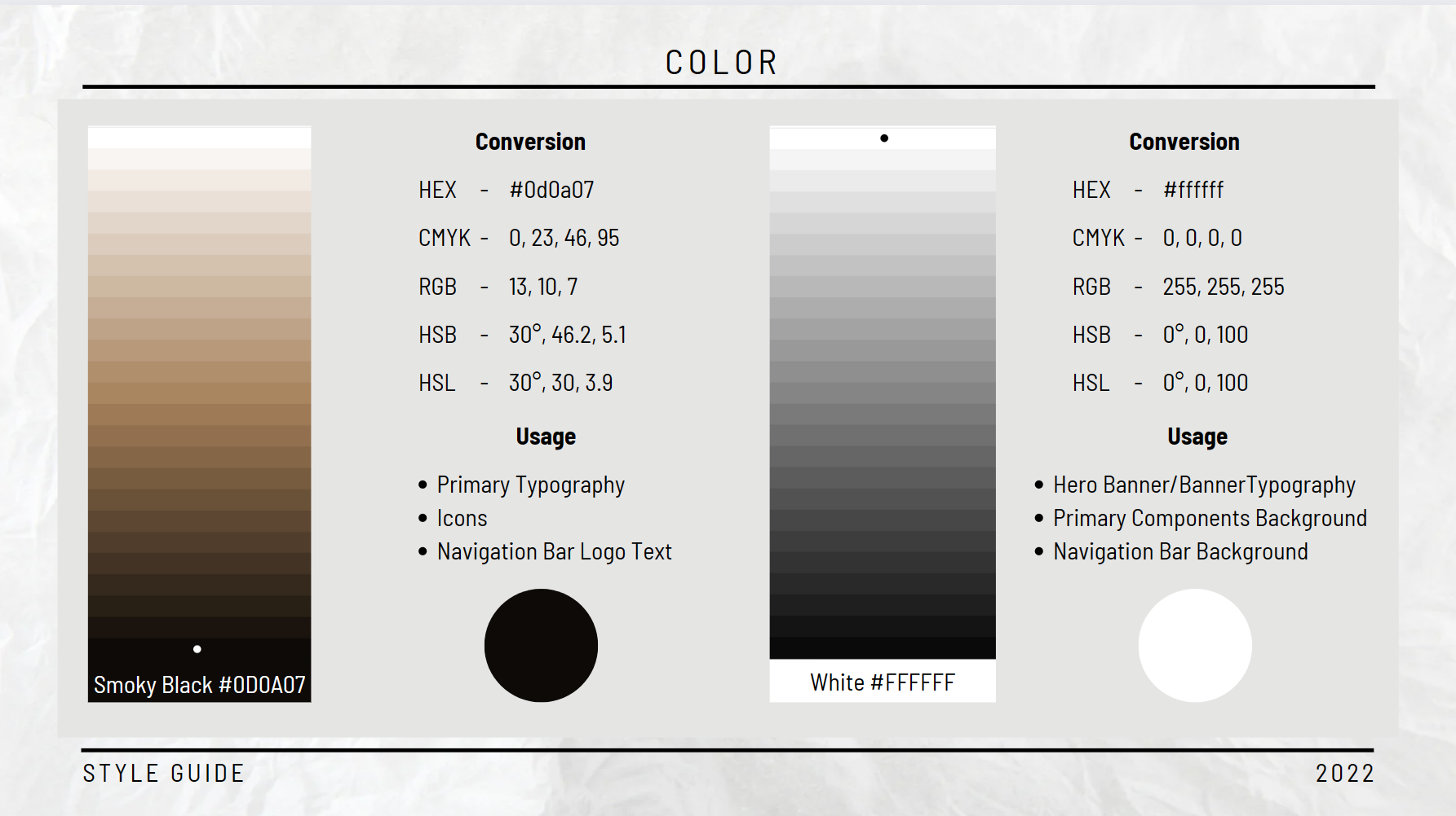
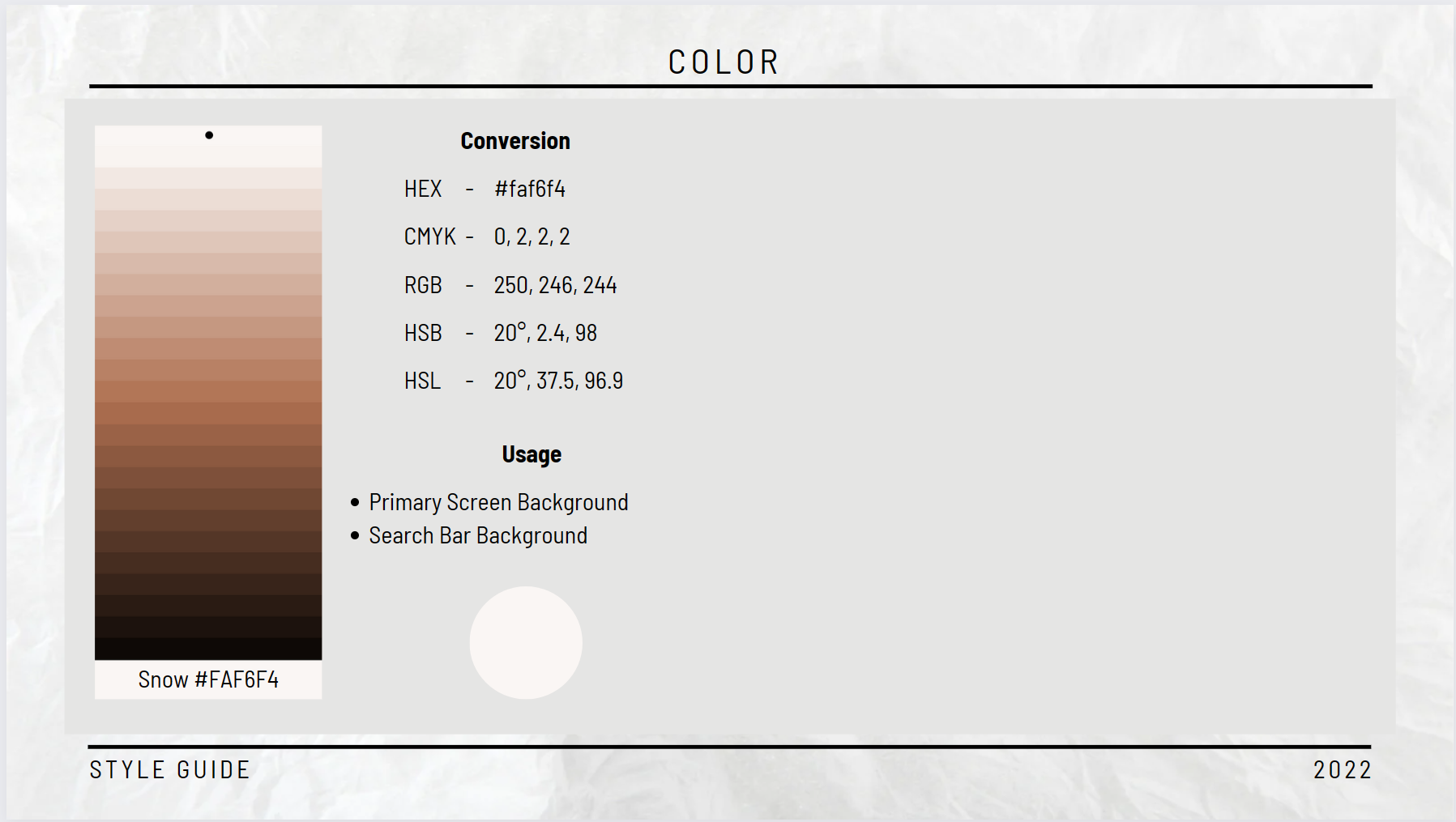
Color Palette
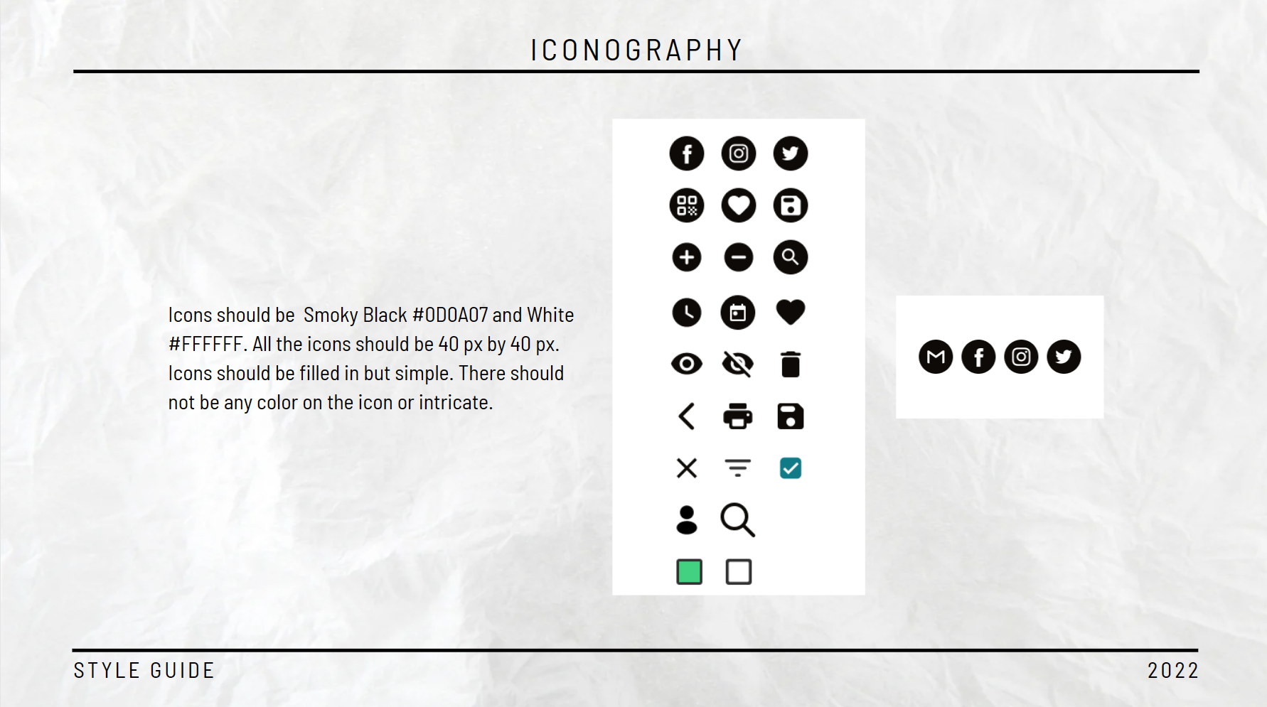
Component Library
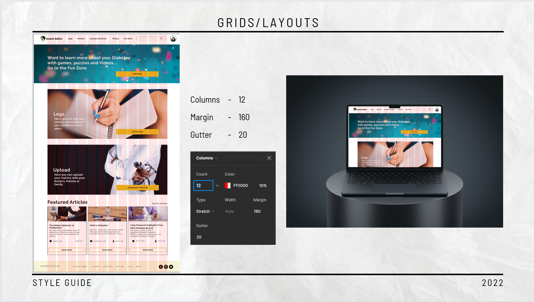
Grids and Layouts
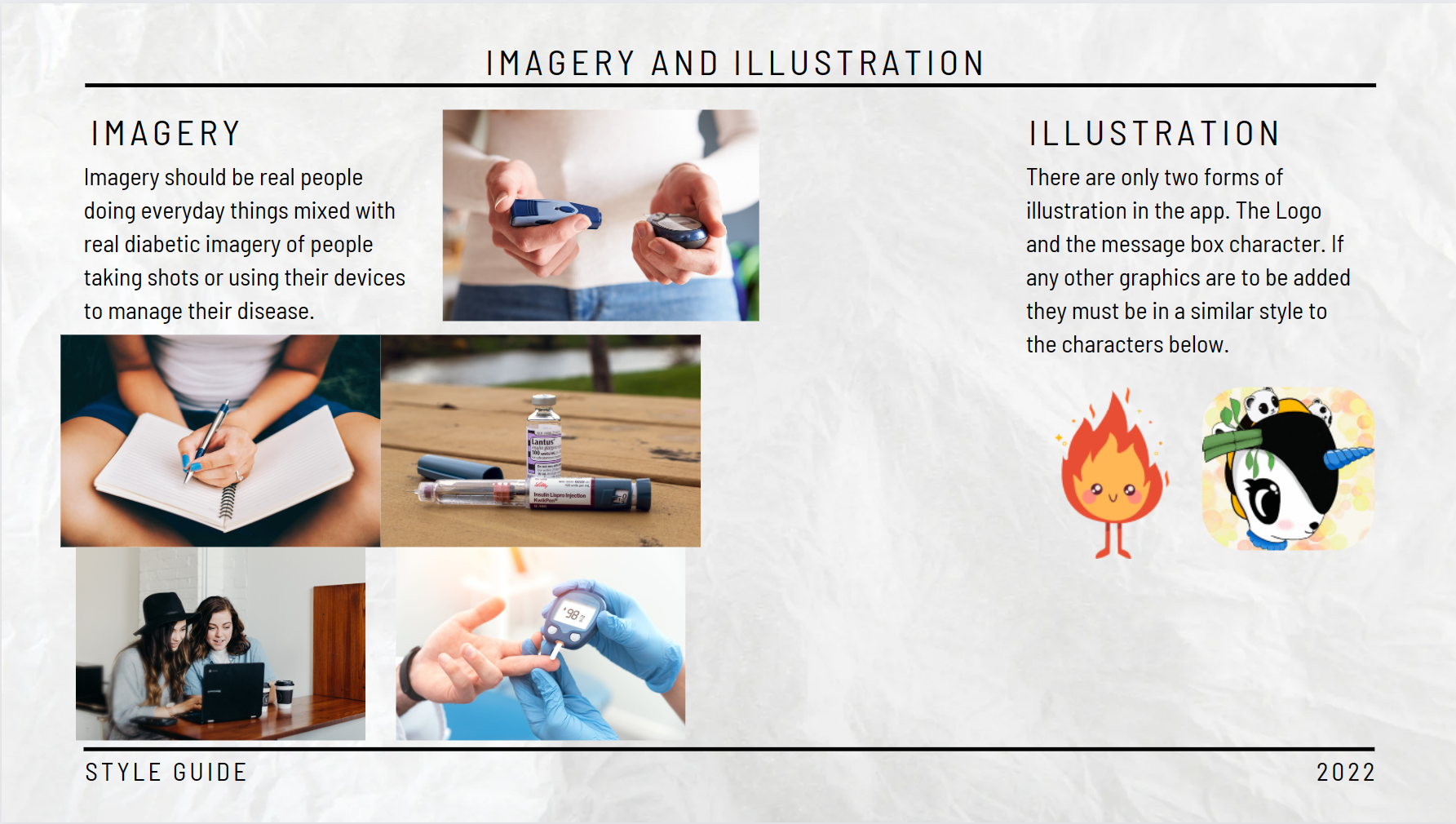
Illustration & Imagery
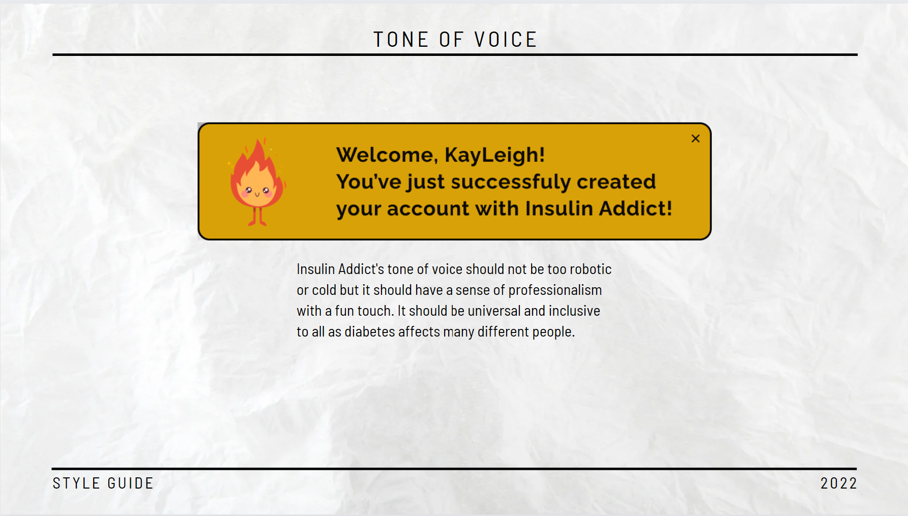
Tone-of-voice
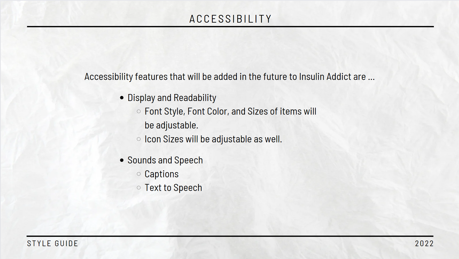
Accessibility
Our Learnings
Finding users for user testing was challenging as there were specific criteria that needed to be fulfilled by the participants to best reflect our target audience. We would need to prepare more in the future and use better resources to find participants.
We need to determine the breakpoints for the designs properly, so we cover the most common screen sizes within our target audience.
We needed more user testing until the app fixed all pain points. User Testing is so important to any app design. USER TEST UNTIL YOU CAN’T USER TEST ANYMORE. LOL.
Getting input from a developer was very helpful as it really allowed me to understand their side of creating the app. It really helped influence our design as we kept them in mind as well.
Future Iterations
For future iterations of Insulin Addict, we have a few things planned from adding new features, using only certified articles, and getting support from doctors. The new features we are hoping to add are:
the ability to scan in medications and have them on file for the user
adding in the fun zone that includes games and fun videos
the ability for the user to add metrics via speech-to-text and
adding in a self-care/mindfulness section for how to emotionally handle diabetes.
Having completed that stage of the project, we asked ourselves questions to properly assess the next steps.
What features were not implemented in this round of iteration? We will implement the features listed above and have the app become more beneficial and covers all bases for diabetic's needs.
Are they any friction points that were missed? We will conduct more user testing with a broader audience to catch these issues to ensure everything is running optimally.
We will conduct user testing, preference testing, and conduct user interviews to ensure we have the full scope of what the user needs from Insulin Addict.
The areas of Insulin Addict that we believe need improvements are Articles. There needs to be some more work done around creating a flexible UI that will accommodate long article titles, as well as additional metadata such as the “Doctor Approved” label, and other information validating its relevance and trustworthiness.
Our user testing process will evolve as we begin to polish the app by doing less in-person moderated testing and having more remote unmoderated testing. When the app is launched we can do more testing of the app live by having a set group of users who sign up to test new features and provide their feedback (similarly to the Youtube Premium approach). The rough timeline for these improvements and implementations is 6 months to 1 year.
Thank you for coming on Insulin Addicts Journey!